POLLY POCKET
REBRAND
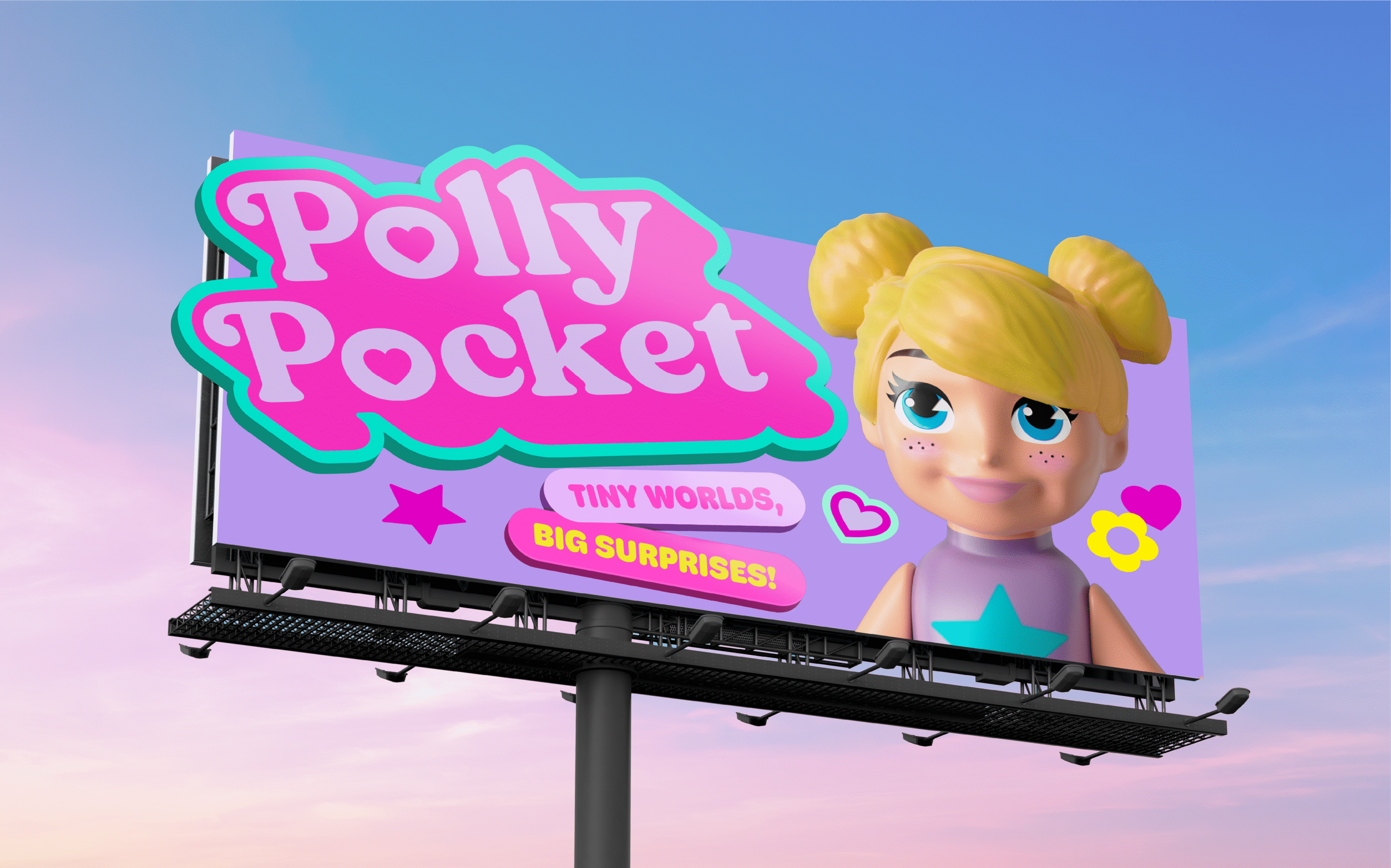
Polly Pocket is back with a bold new look that’s as fun and playful as you remember! New-stalgia at its best; a reimagined icon that honours the magic of the original for those who grew up with Polly, and opening up a whole new pocket-sized universe for the next generation. Fresh, colourful, and full of surprise, our rebrand invites both generations to rediscover the joy of carrying endless adventures in the palm of your hand.
*All lifestyle imagery used on this page is for inspiration only and may not be used for any other purpose*
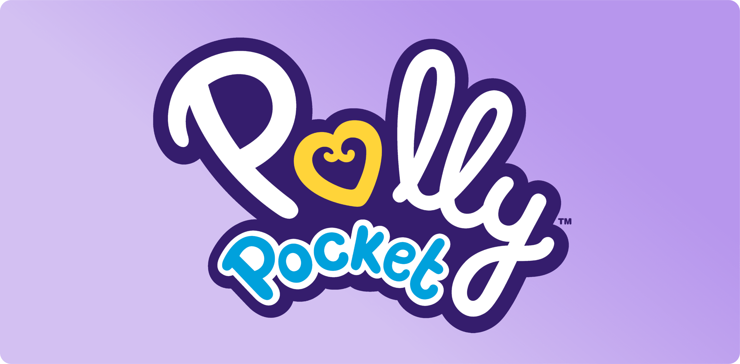
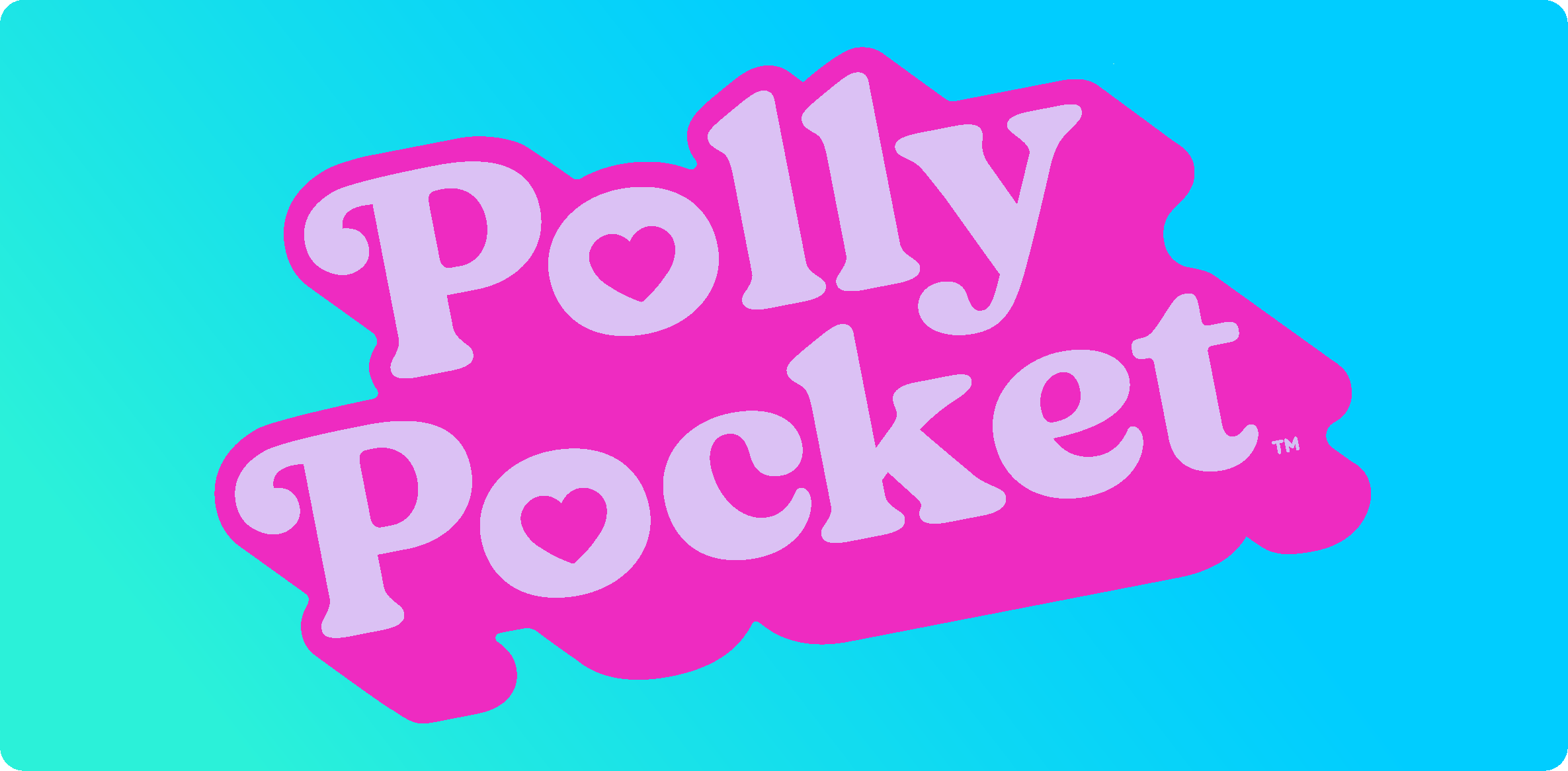
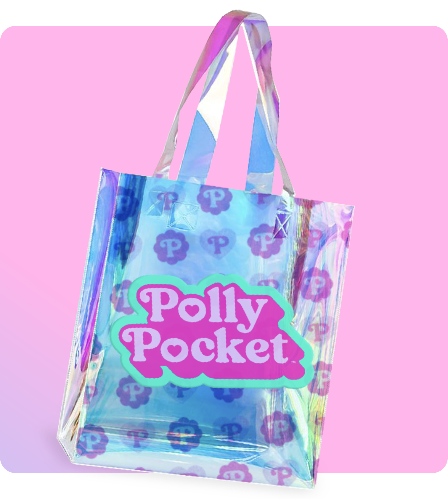
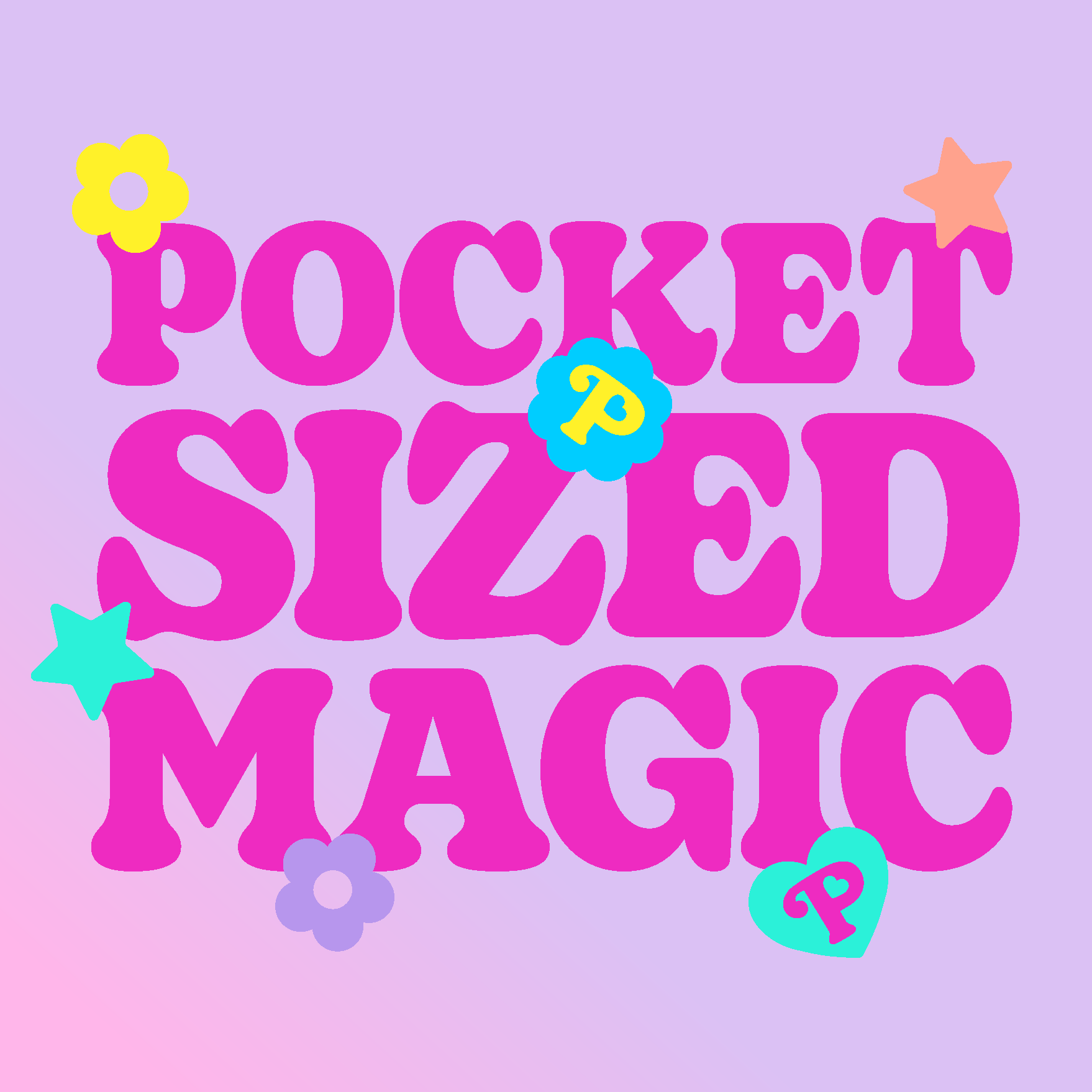
Polly Pocket’s new look is rooted in the magic of its first iconic logo, with original Polly Pocket ‘P’ terminal mark that inspired our thinking. Our design captures the soft, playful spirit of the 90’s with pastel tones and bubbly curves, perfectly suited to its pocket-sized worlds. The refreshed logo carries that spirit forward; bold, bright, and digital-ready. Hot pink and aqua make it pop for today, while heart-shaped details preserve the nostalgic charm that fans know and love.
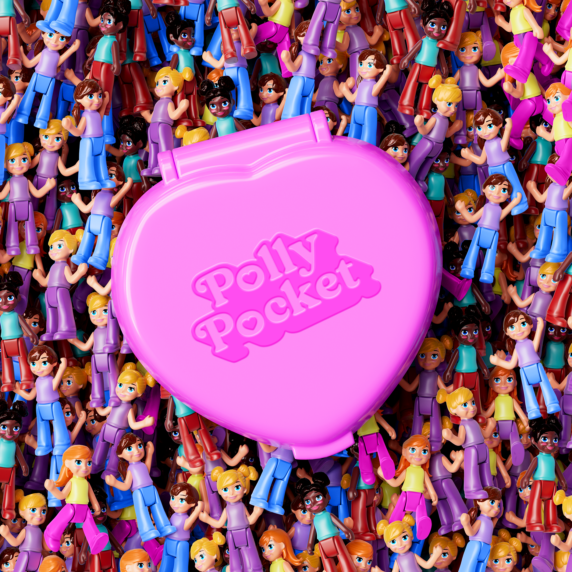
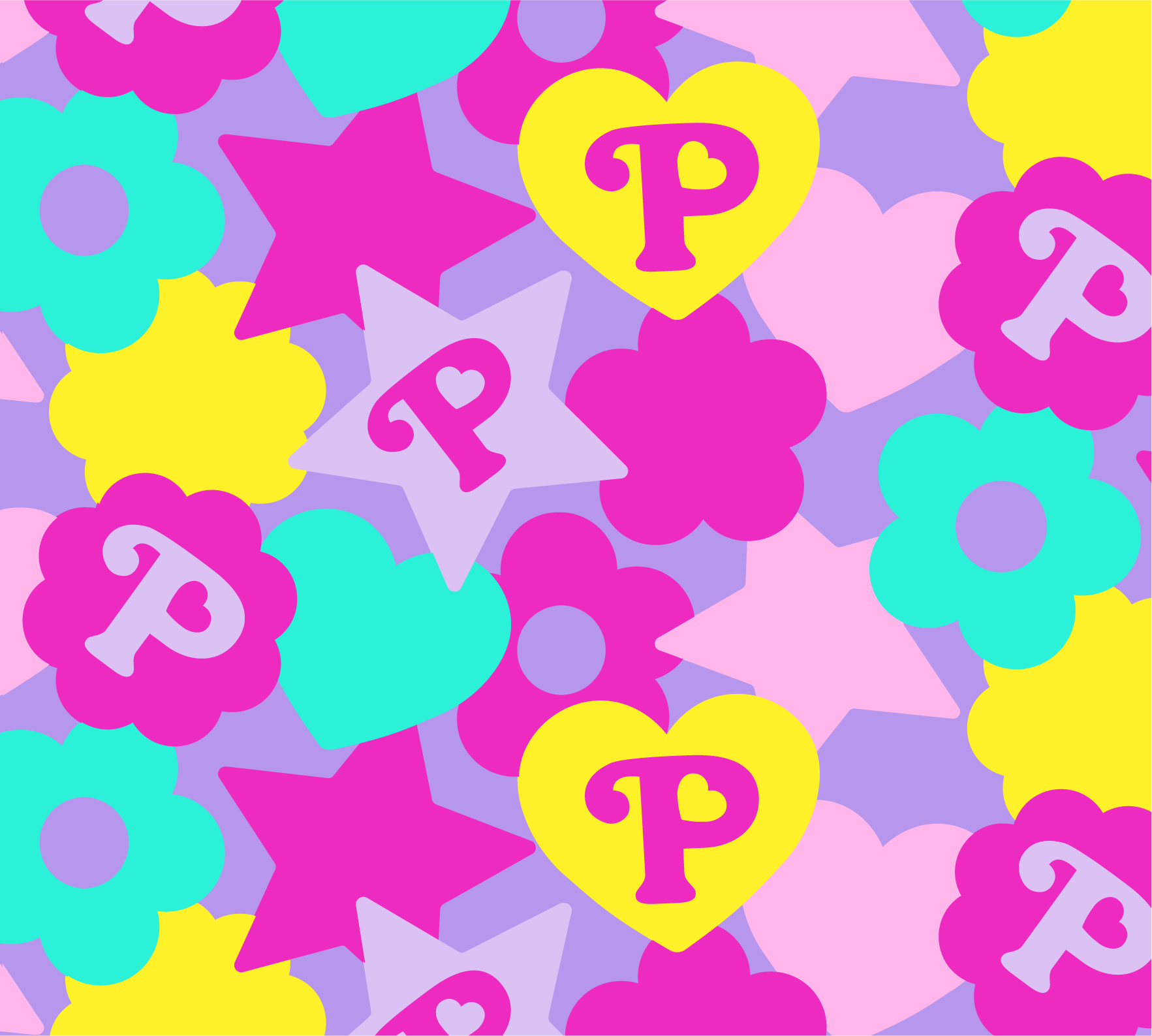
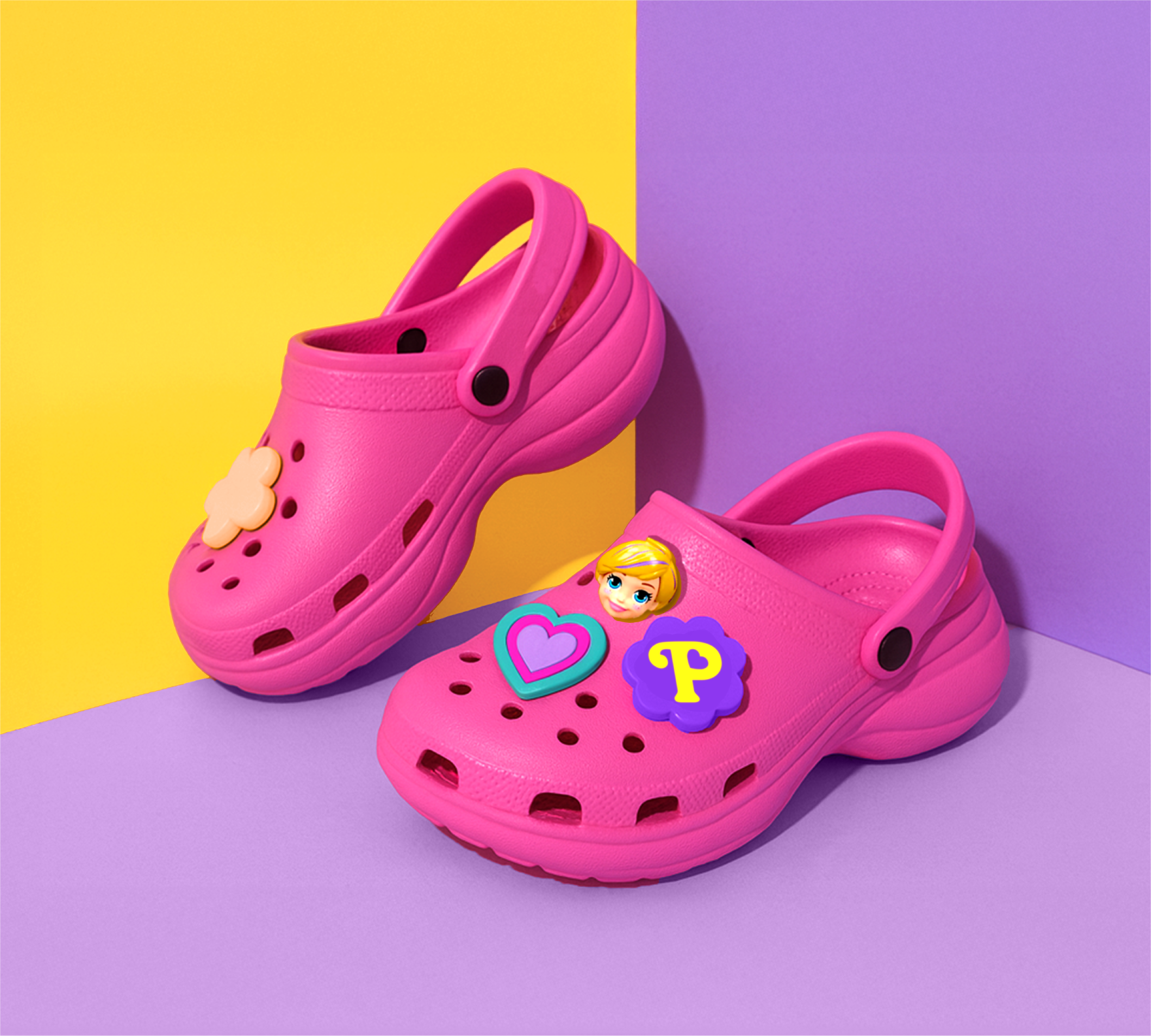
Polly Pocket now plays in the digital world! The rebrand is built to come alive across multiple platforms in playful motion, 3D experiential moments and in bold social assets; making every interaction feel like a new discovery. Designed for flexibility and fun, Polly’s digital presence invites us back into her tiny universe, wherever she now appears.
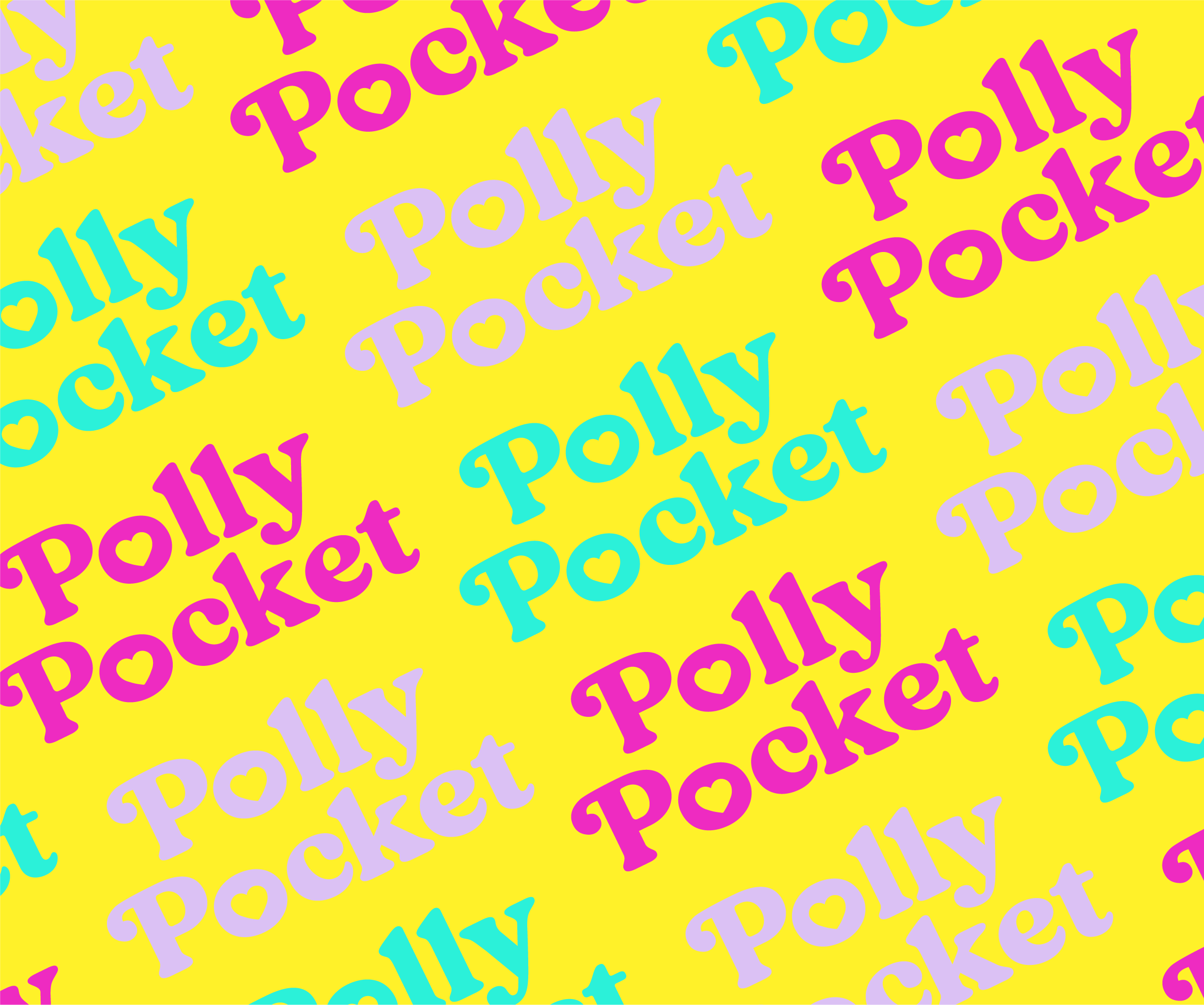
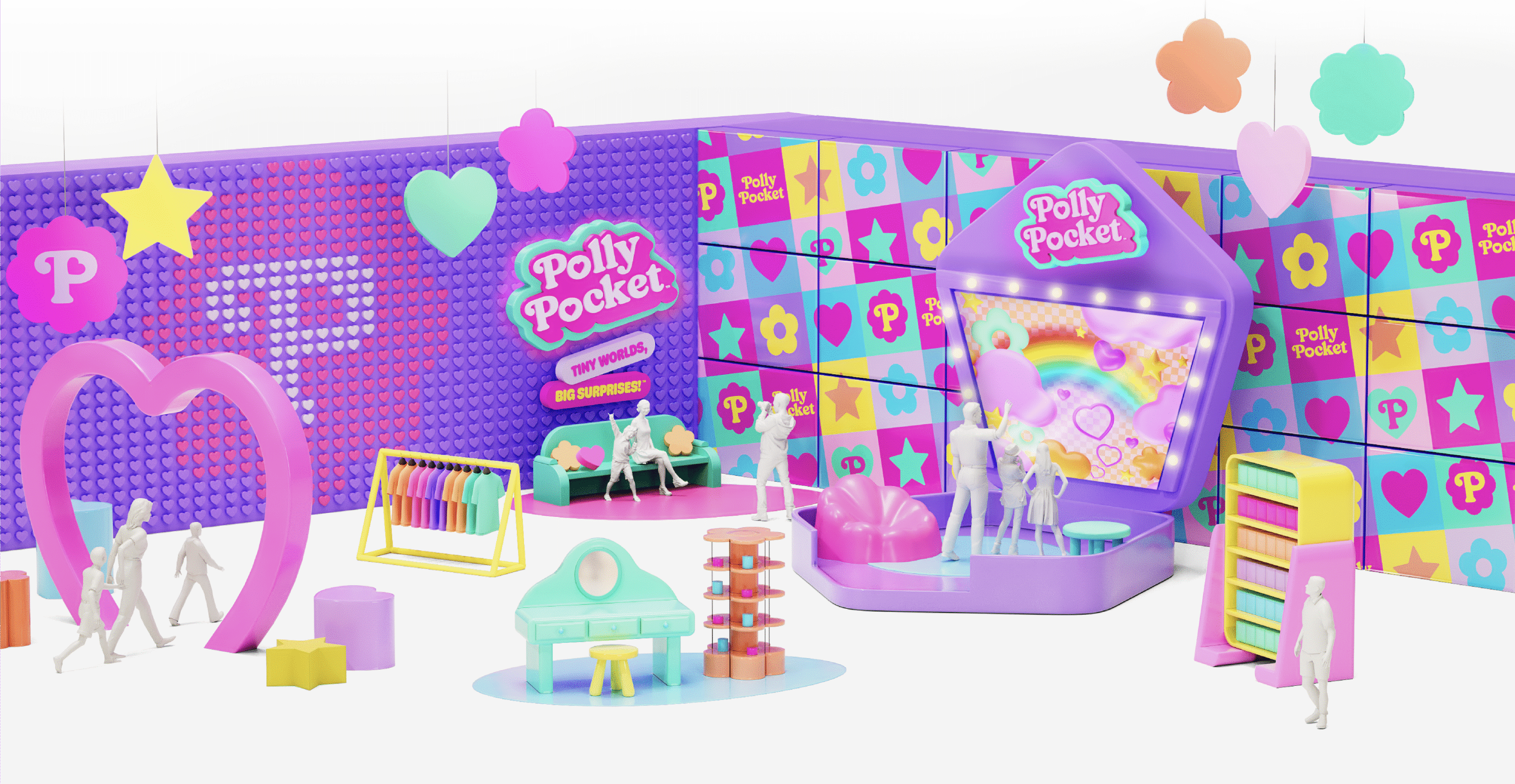
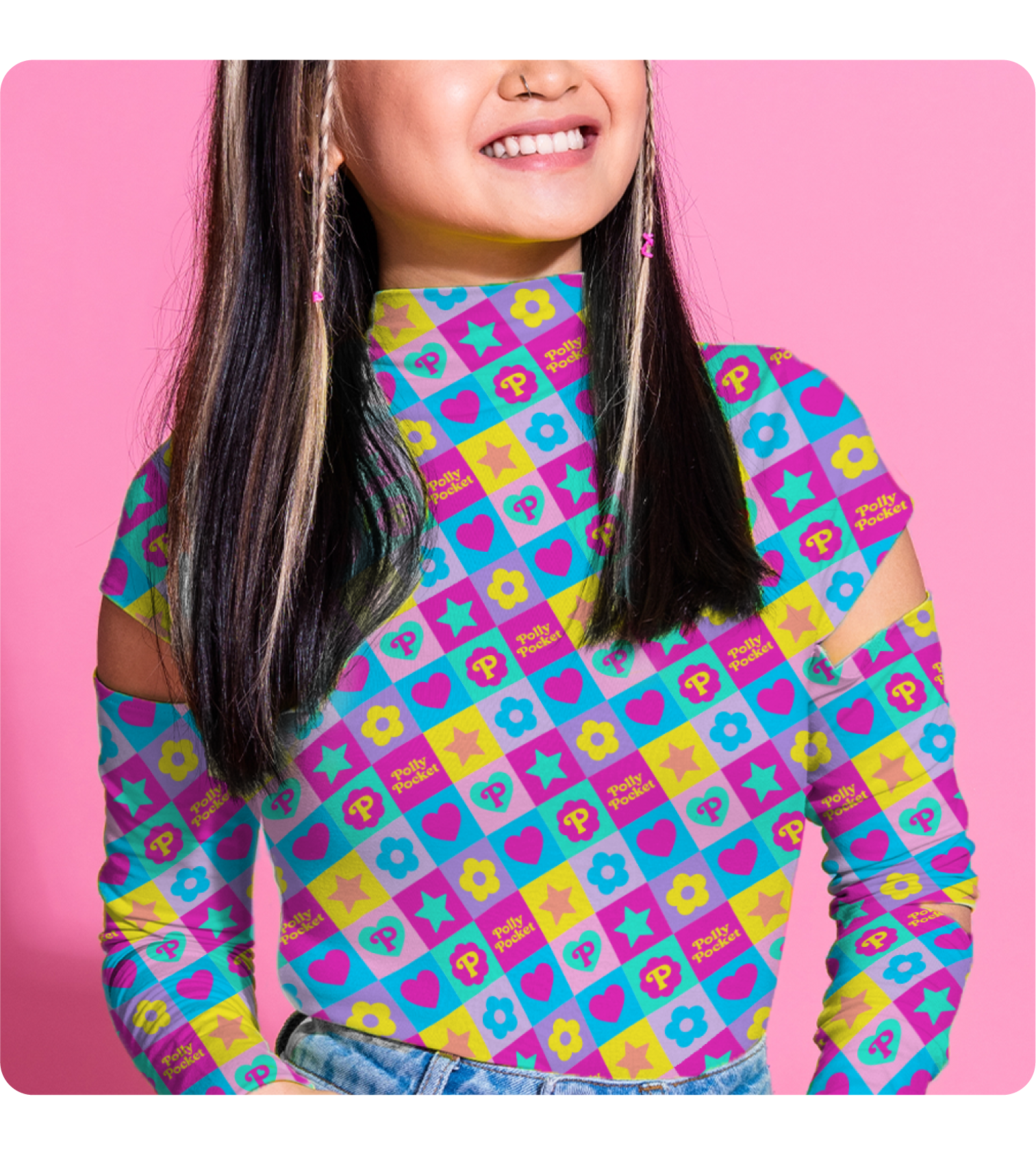
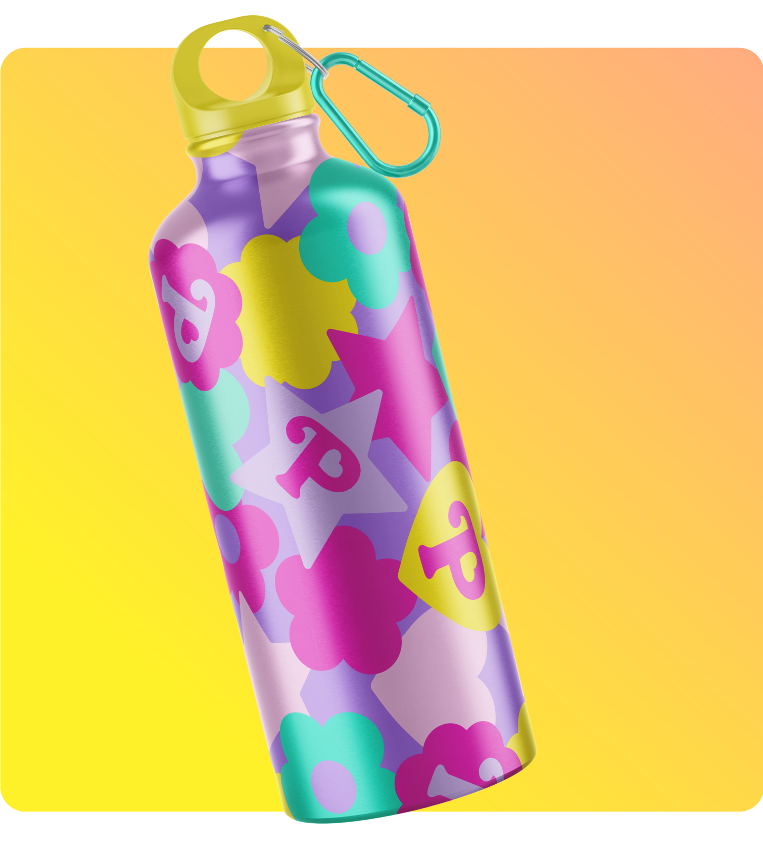
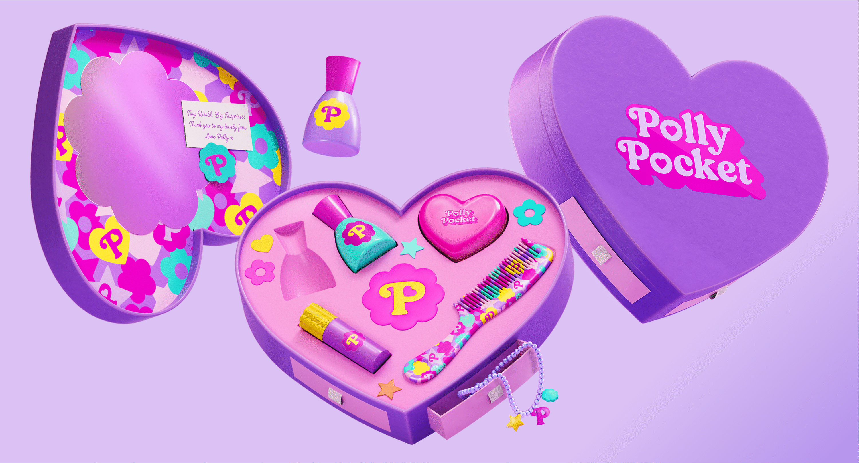
When reintroducing Polly to the world, we’ve designed and 3D-imagined fashionable product influencer kits. Similar to the AirBnB, the legacy can take over the boundaries of just toys, into apparel, beauty and lifestyle alike.
Thanks to
the Mattel Brand & Marketing Teams
