PEACE TEA
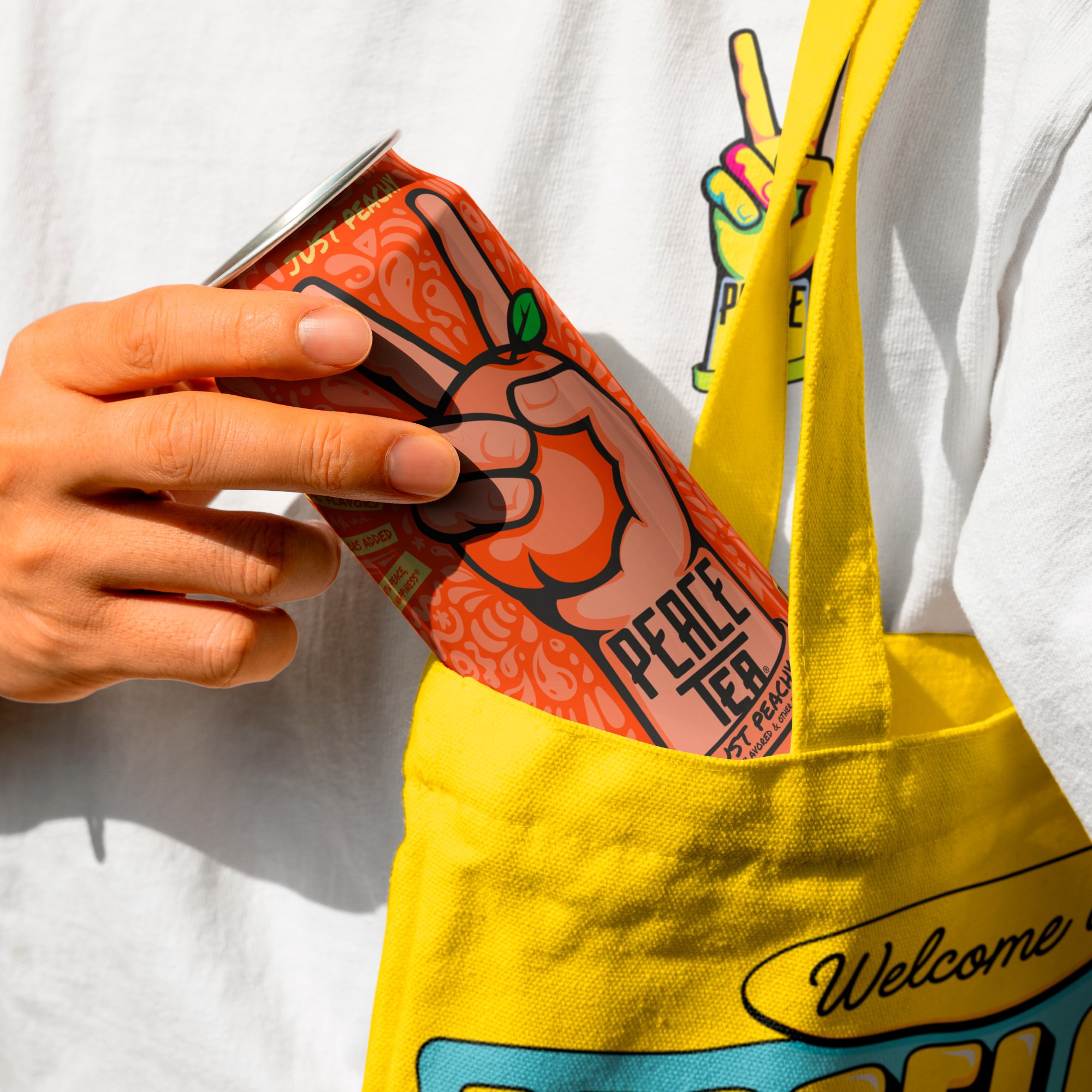
Peace Tea had expressive can designs, but no supporting brand world to match their energy. Our task was to create something vibrant, joyful, and flexible. A graphic language that could bring the brand to life beyond the can.
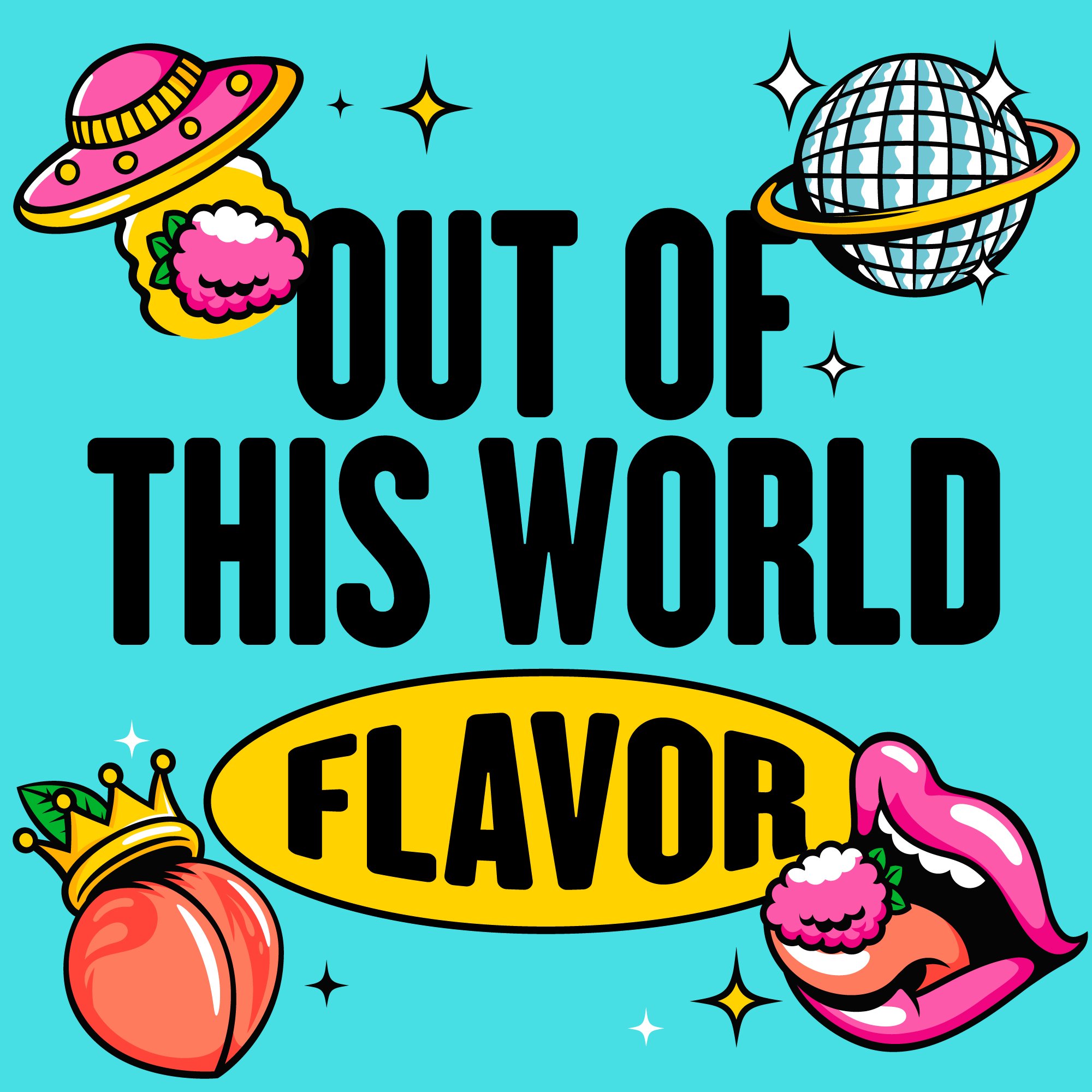
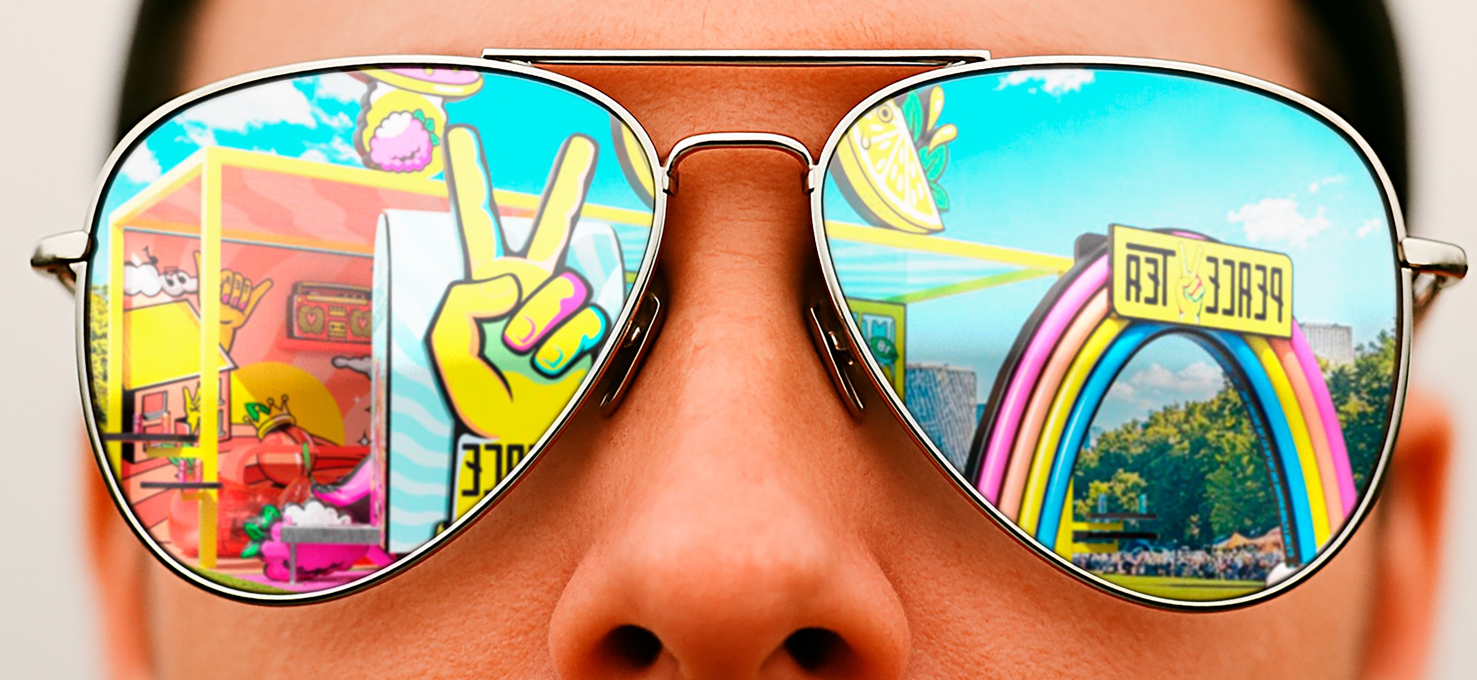
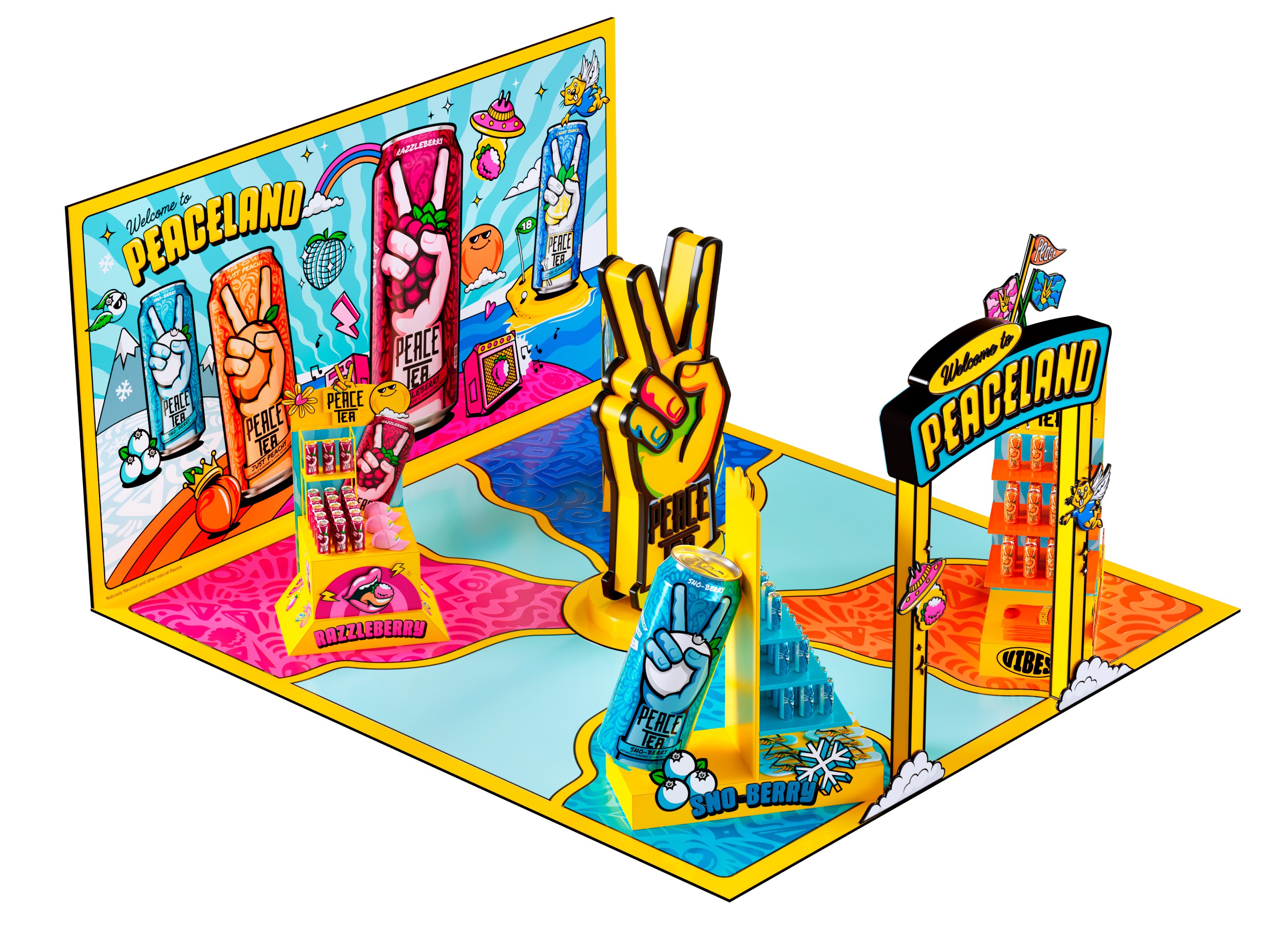
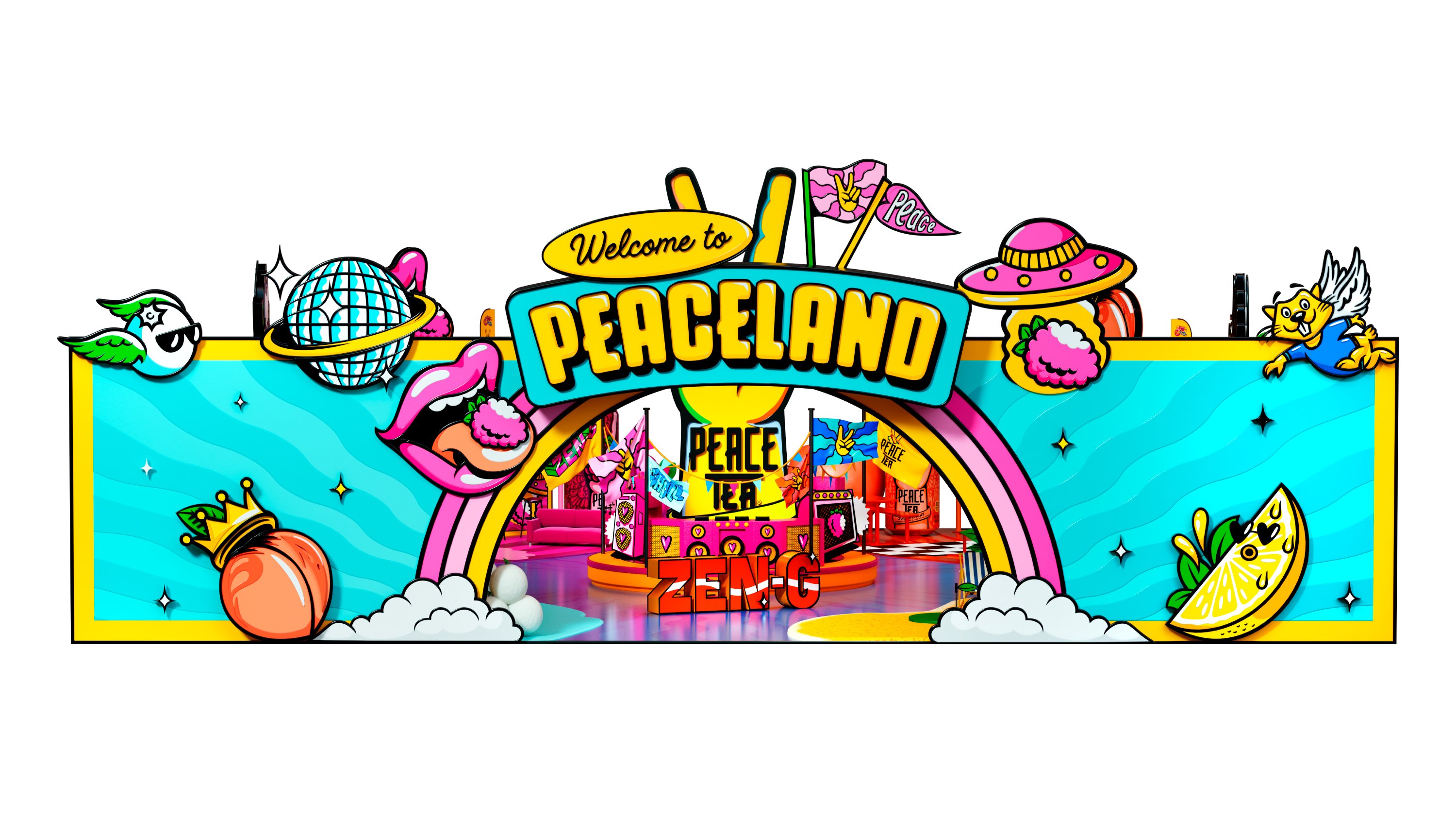
Our strategic idea was simple and powerful: “Welcome to Peaceland” – A psychedelic utopia and a festival of positivity. Inspired by music culture and self-expression, Peaceland is a place where individuality is celebrated, playful energy is everywhere, and Peace Tea is always headlining.
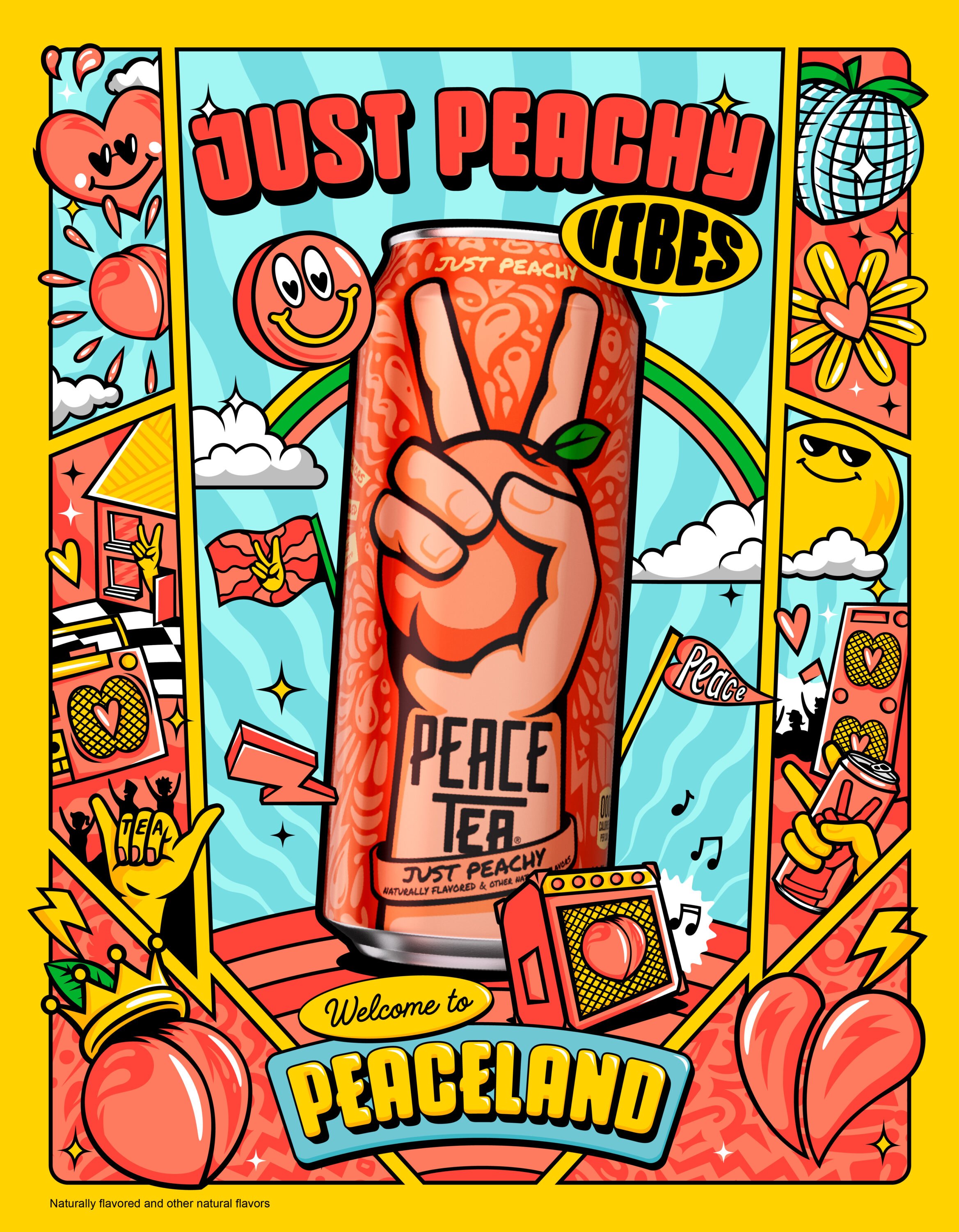
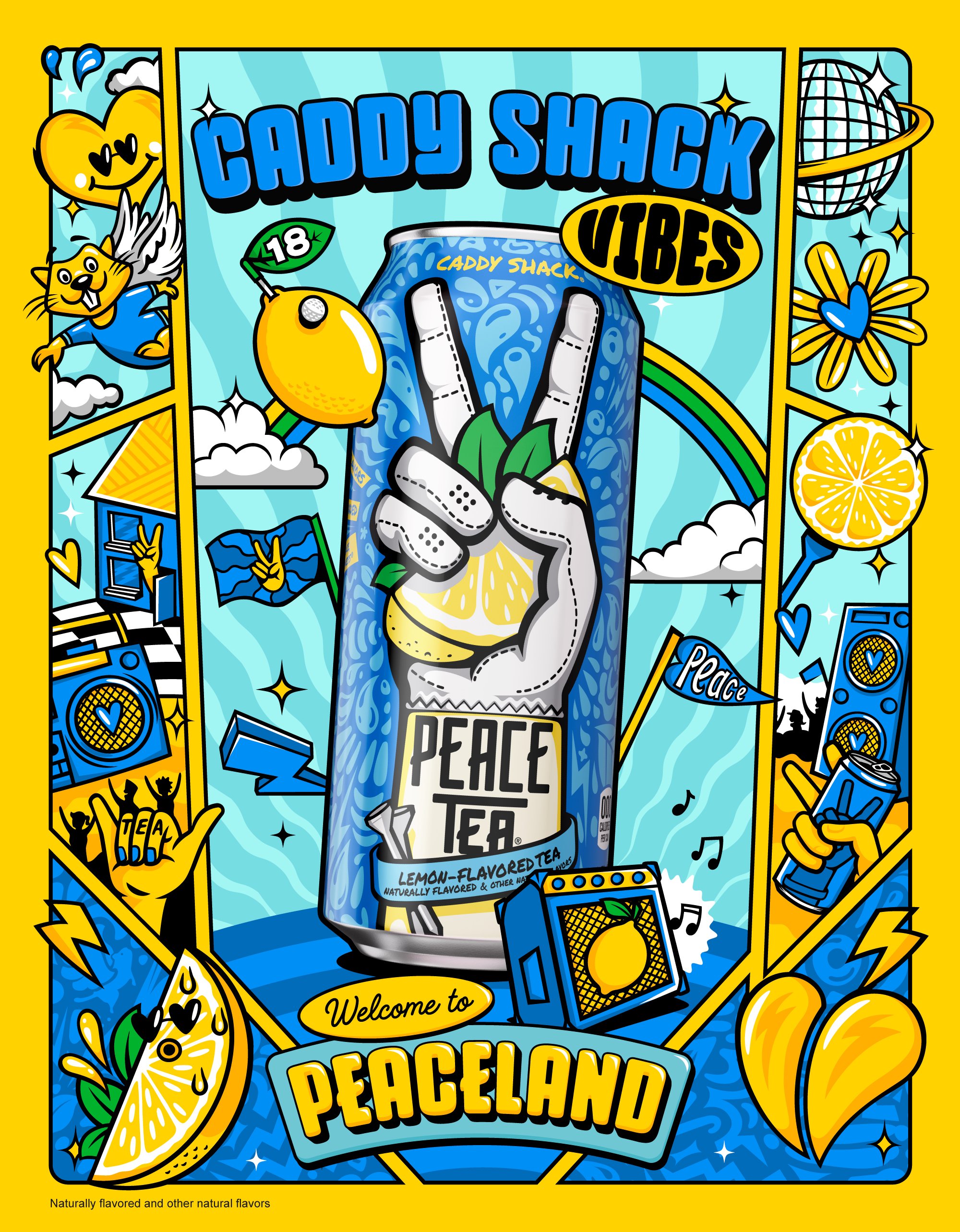
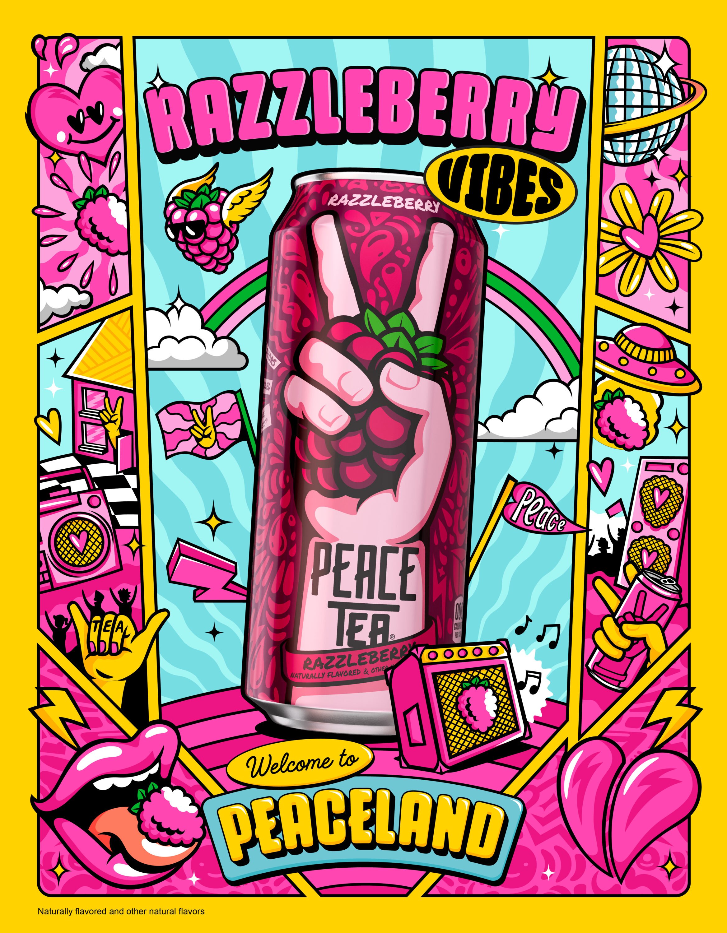
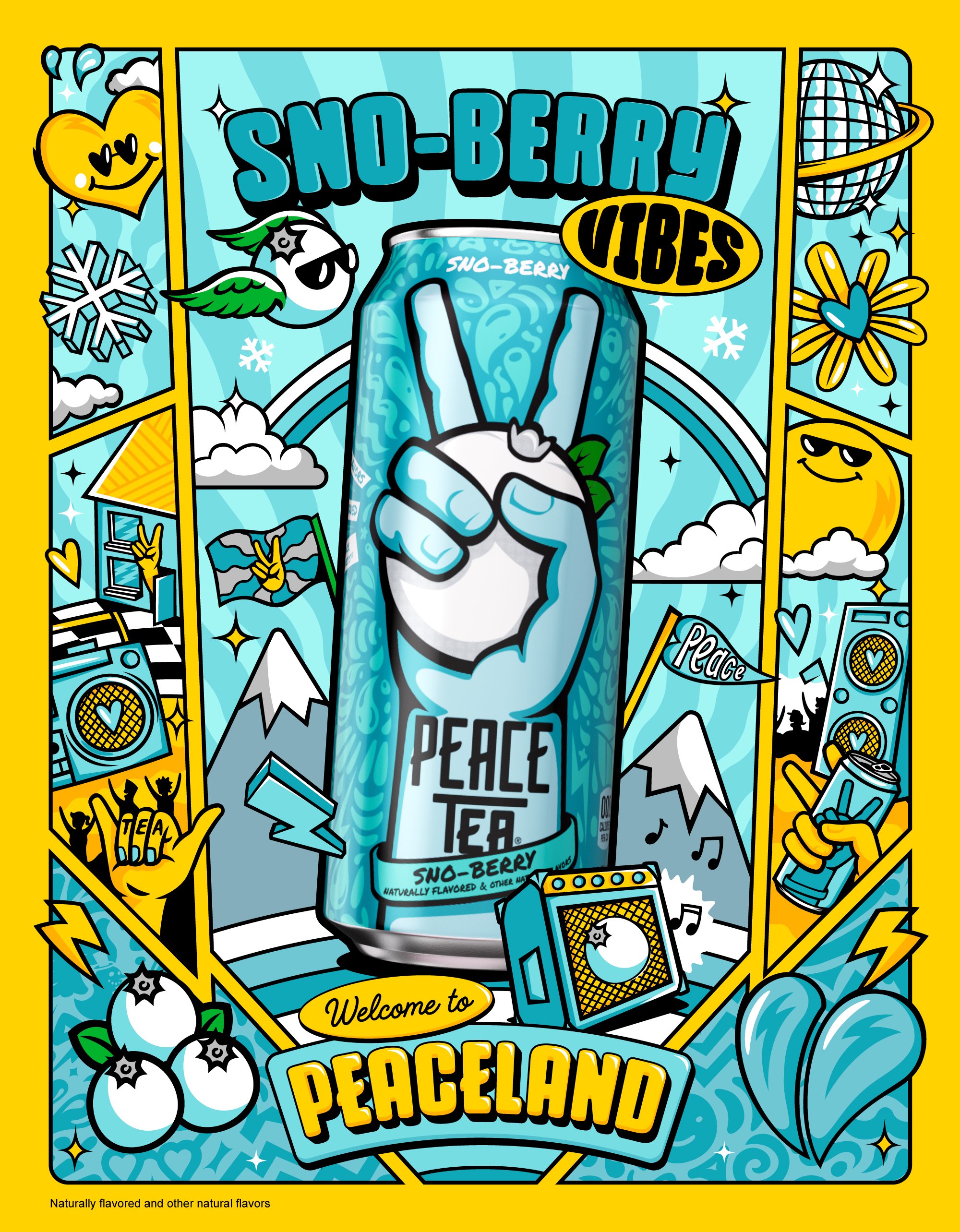
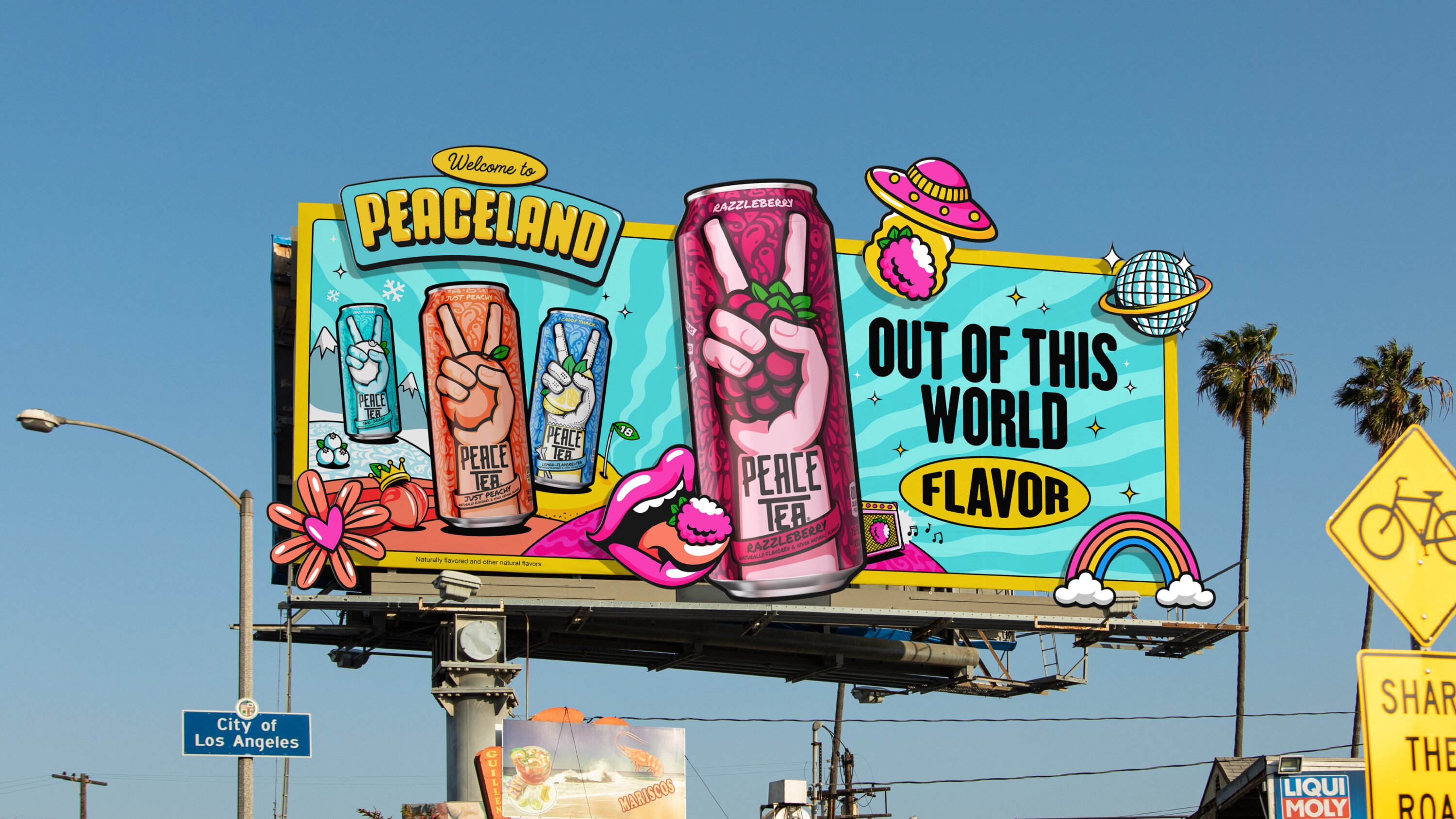
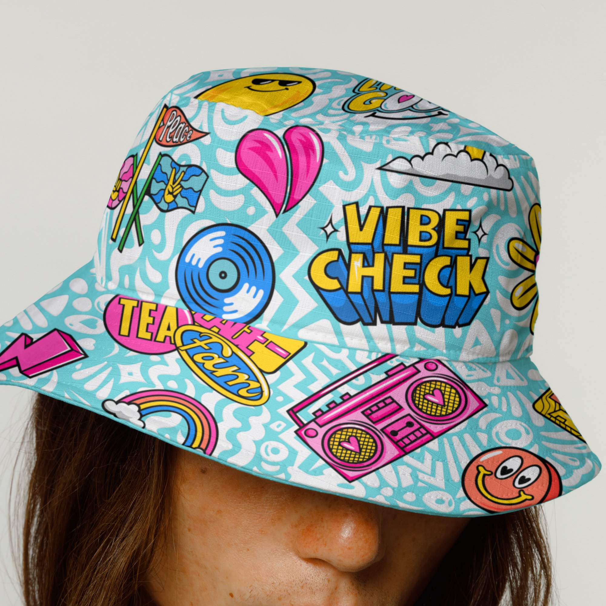
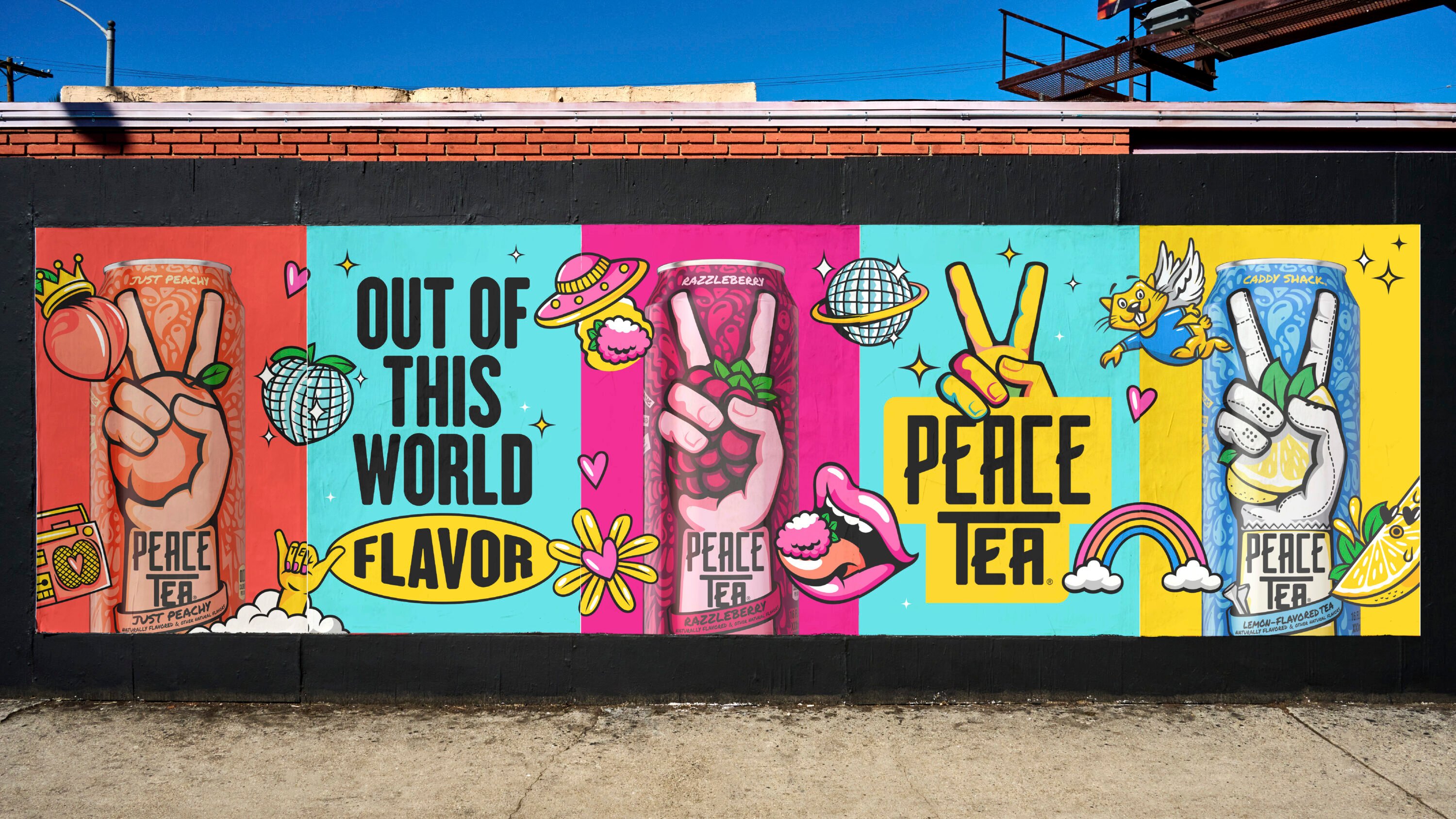
We brought Peaceland to life with 50+ bold illustrations, stickers, and GIFs from juicy lips to disco balls and UFOs beaming up fruit. Some were flavour-specific, others universal, all full of character.
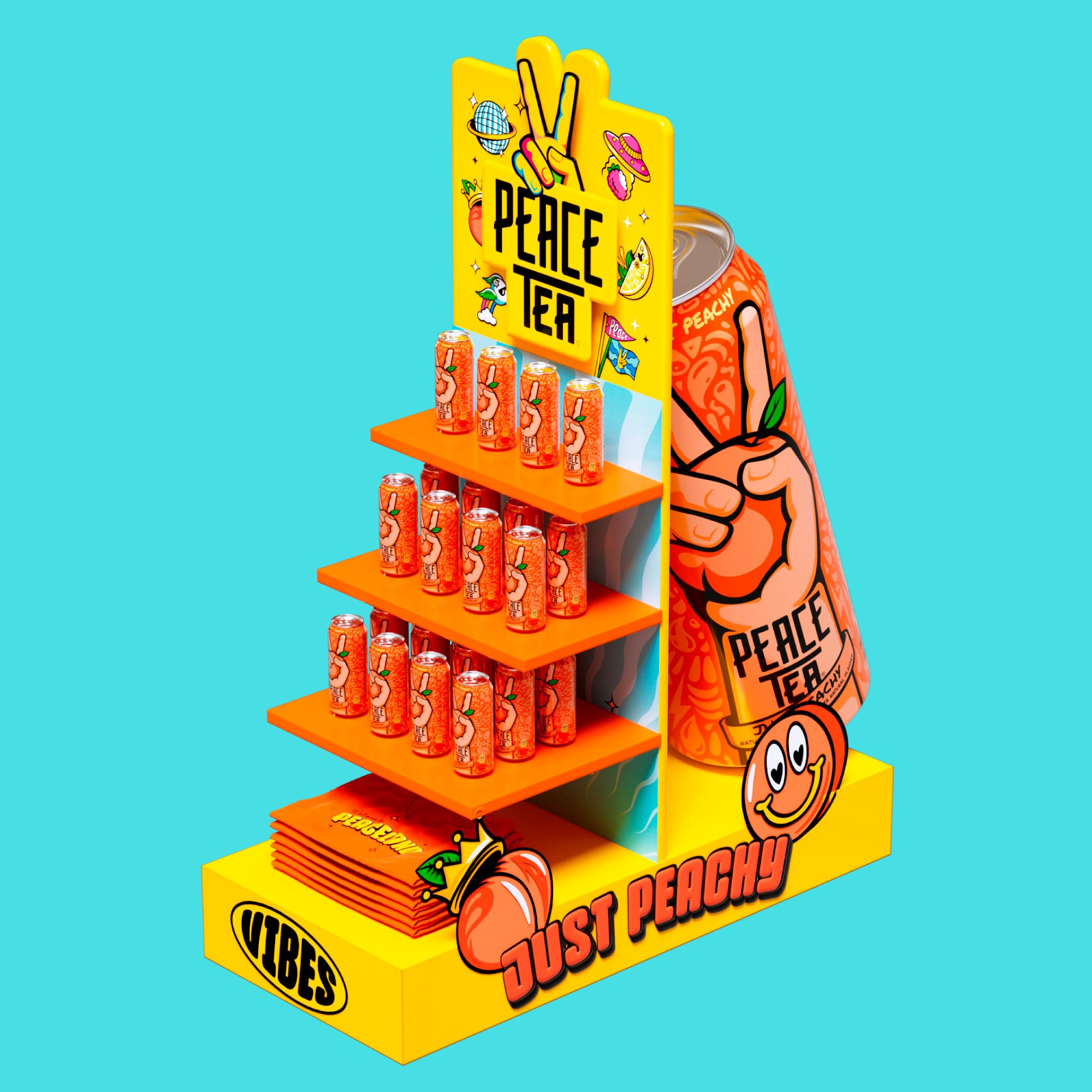
We created one hero film, four flavour-led animations, and a full suite of shopper assets, all tied together by a festival-inspired design system that made Peace Tea feel like a world you could step right into.

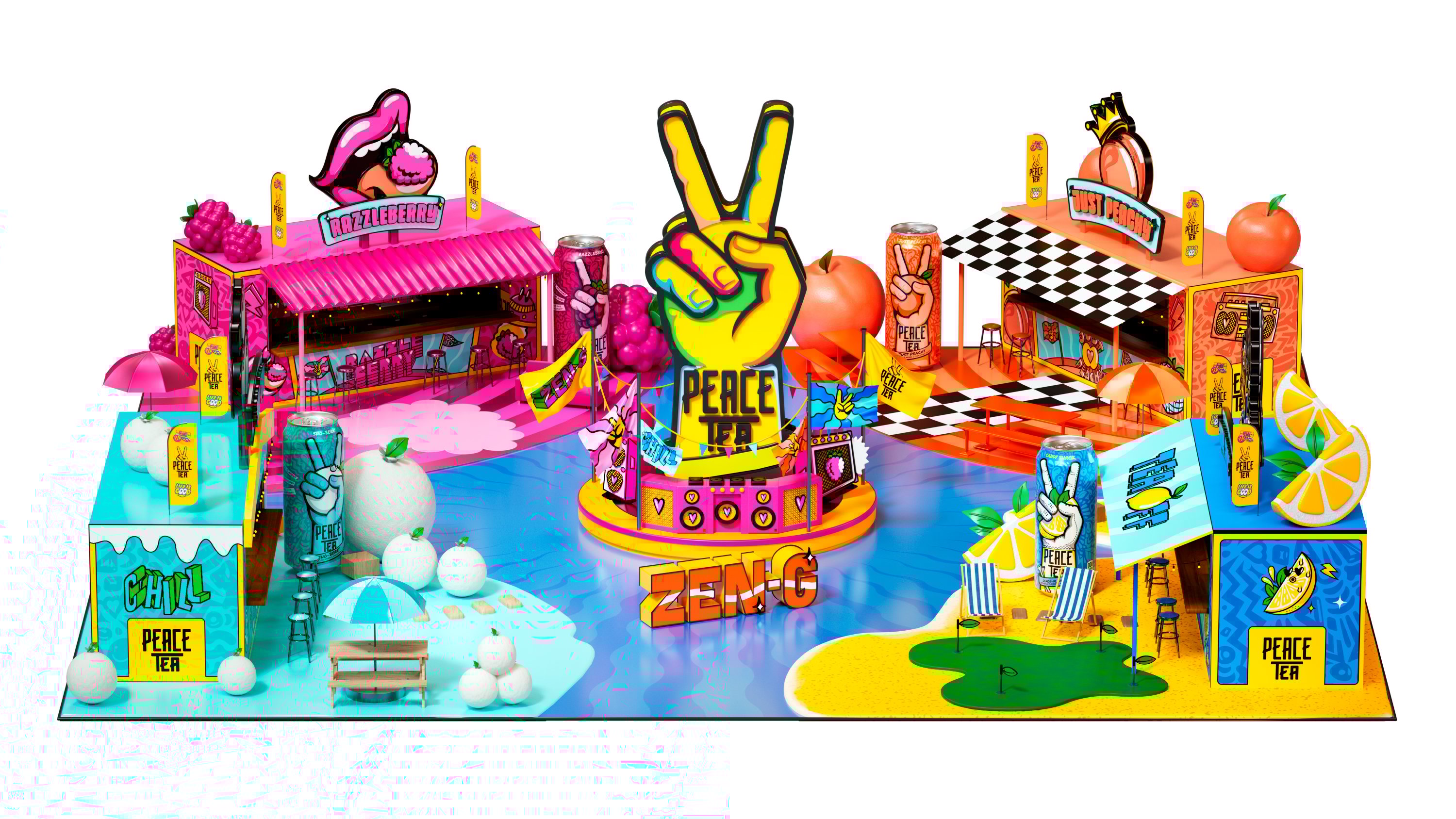
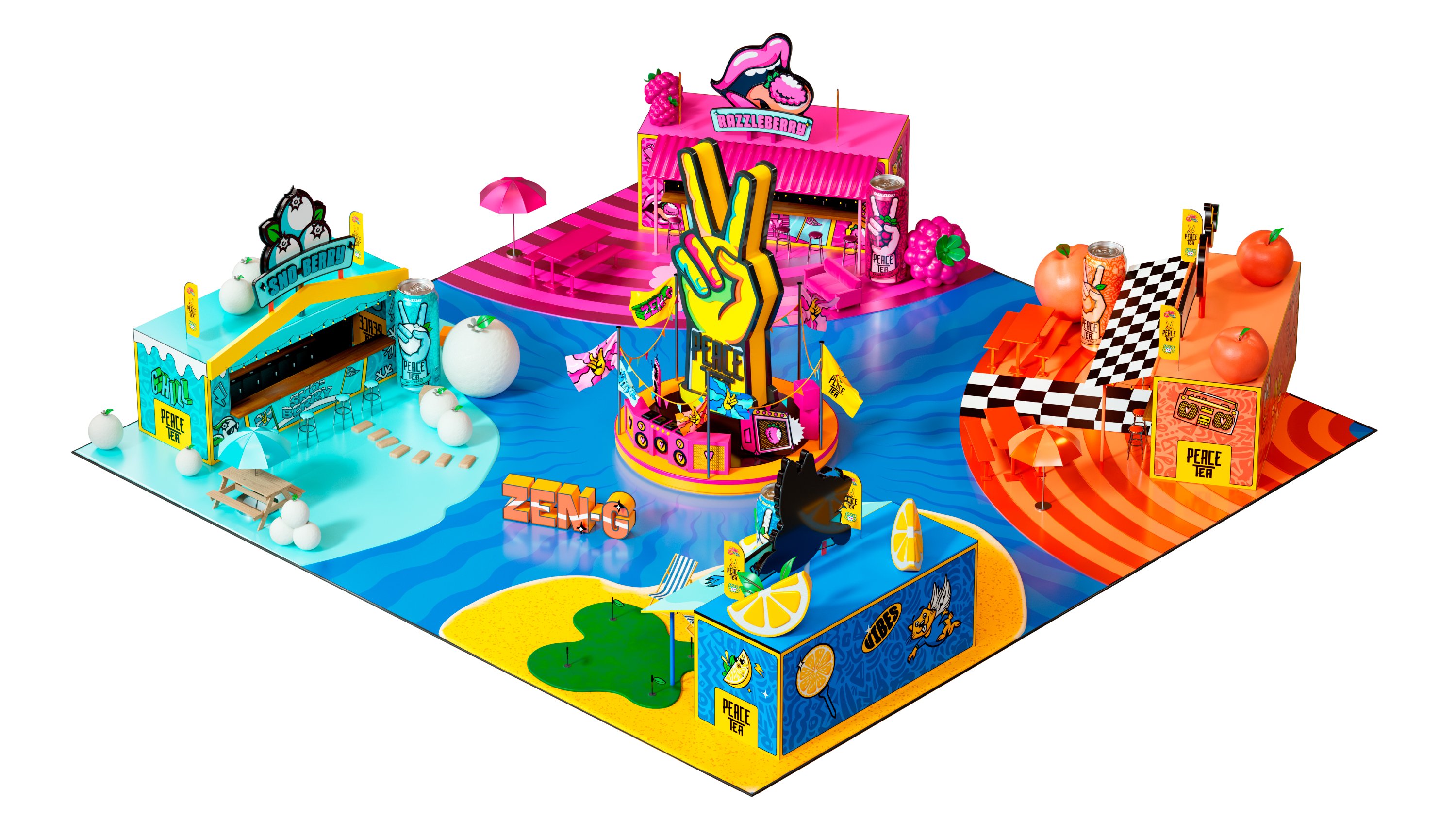
To bring Peaceland into the real world, we designed a suite of bold, high-impact activations for both festival environments and retail spaces all nodding to the energy of a summer music festival. Each can flavour was treated as its own “island” within the world, brought to life through vibrant staging, oversized illustrations, playful messaging, and colour-rich visuals that echoed the can design.
We didn’t just make illustrations and key visuals, we created a world. One that gave Peace Tea a fresh lease on life, helping the brand show up anywhere with confidence, colour, and personality.
The new assets have been embraced across digital, retail, and live experiences, including activations at major events like NYC’s Gov Ball. Peace Tea now has a voice and vibe that connects with its core Gen Z audience, celebrates individuality, and amplifies the flavour-forward feel of the cans… All you need is peace, love, and tea.
Thanks to
The Peace Tea team


