Vol. 4 Fragments
35-page Report
Fragmentation isn’t new. Culture has never arrived in one neat, linear hit.
What’s changed is the landscape around it. There are more places to land, more ways to be discovered, more communities to belong to, and more opportunities for an idea to travel.
Preview
What’s inside
Four design trends. Four colours. Three creative perspectives. One 35-page look at how fragmented culture is changing the way brands get noticed, remembered and experienced.
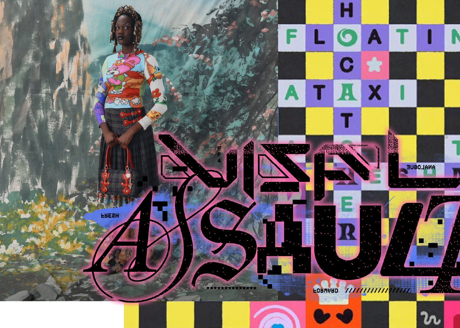
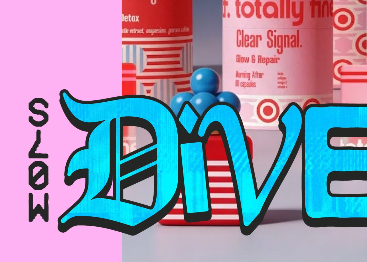
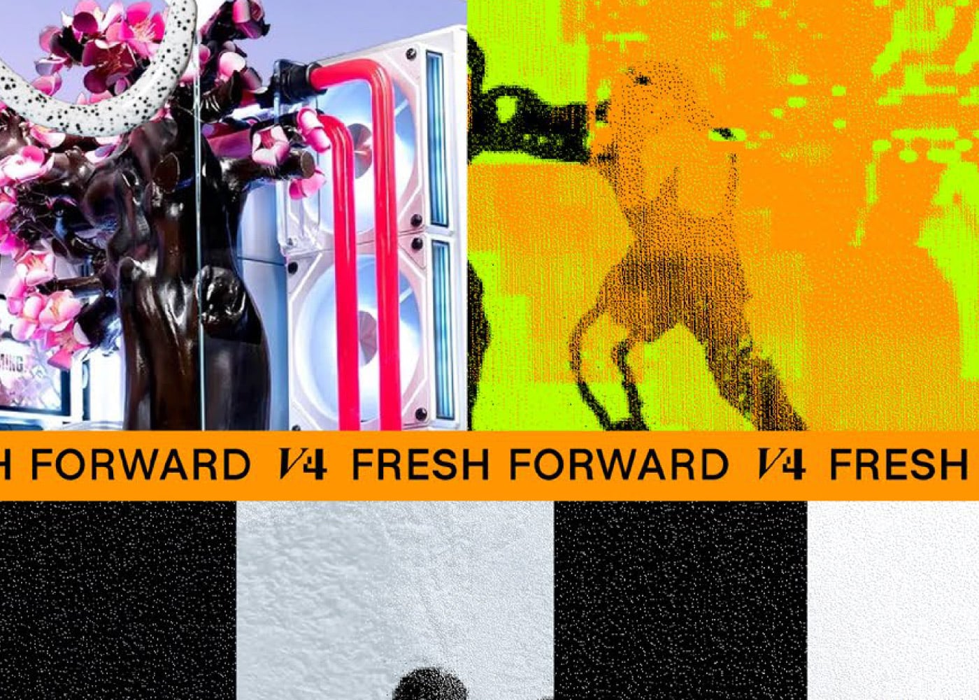
Colour Trends Vol. 4
Colour is never neutral, not when it comes to evoking emotion and opinion.
GETTING SEEN ISN’T THE PROBLEM; BEING CARRIED IS.

What’s shifted since is harder… getting seen isn’t the problem; being carried is. What I mean by that is plenty of work goes out now and simply doesn’t travel like it did before. Because nothing picks it up. Making it and getting it to people are two jobs now. Not one. And most studios are still only sorted for the first.
BRANDS ARE DESIGNING
FOR A FASTER PACE …
…but, in my opinion, they should be designing for a slower one. The ones that reward a second look or more attention, from me at least, are the ones clearly not designing for the algorithm. I think designing at a slower pace rewards attention at a slower pace, and therefore more concentration and connection.
[FF/ FRAGMENTS]
Colours
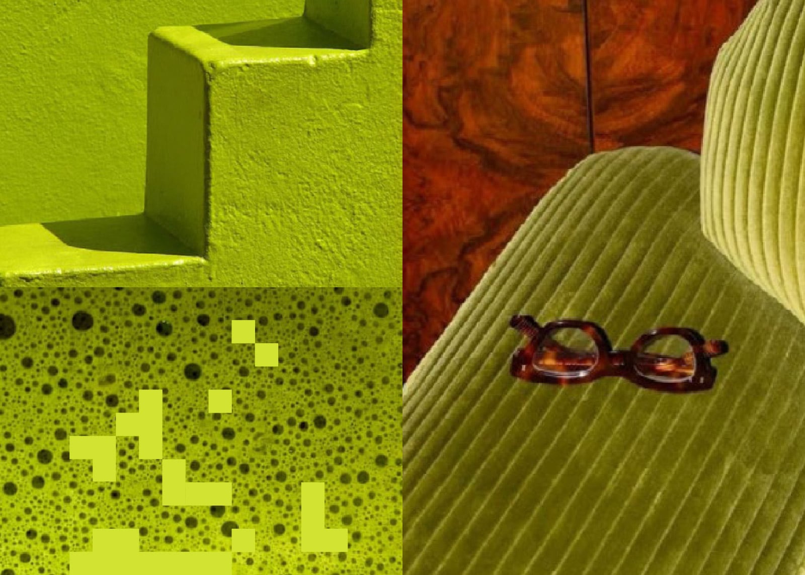
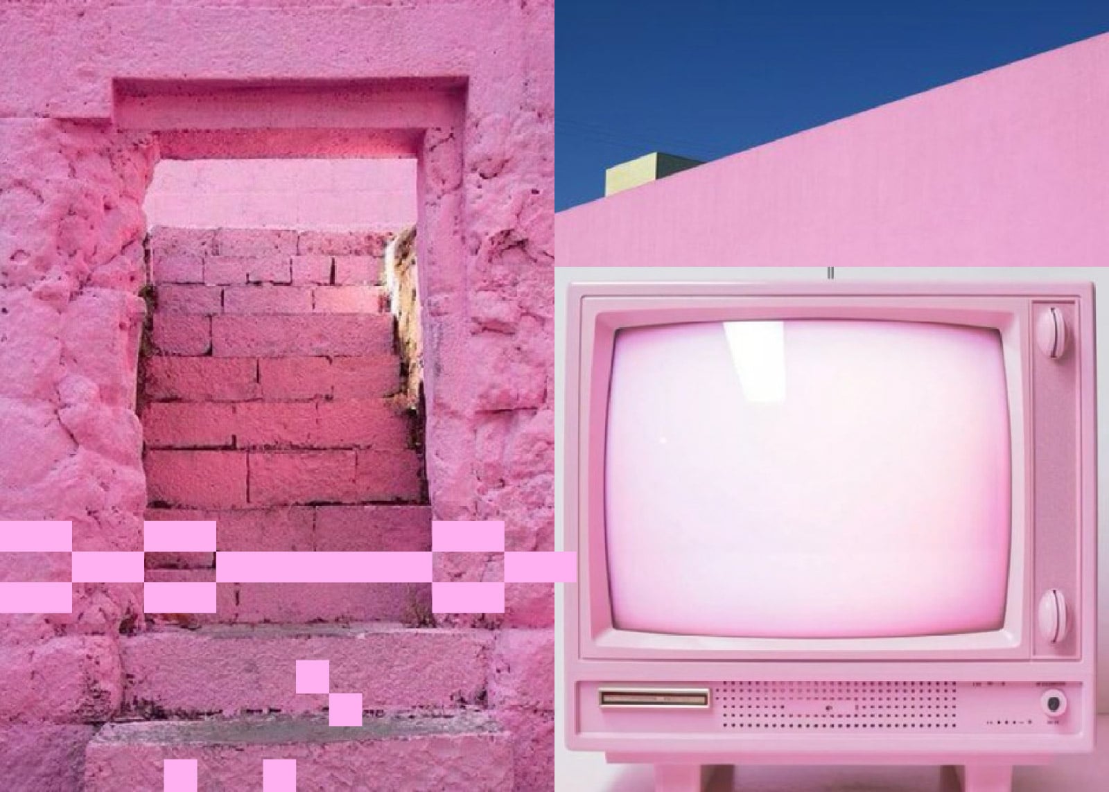
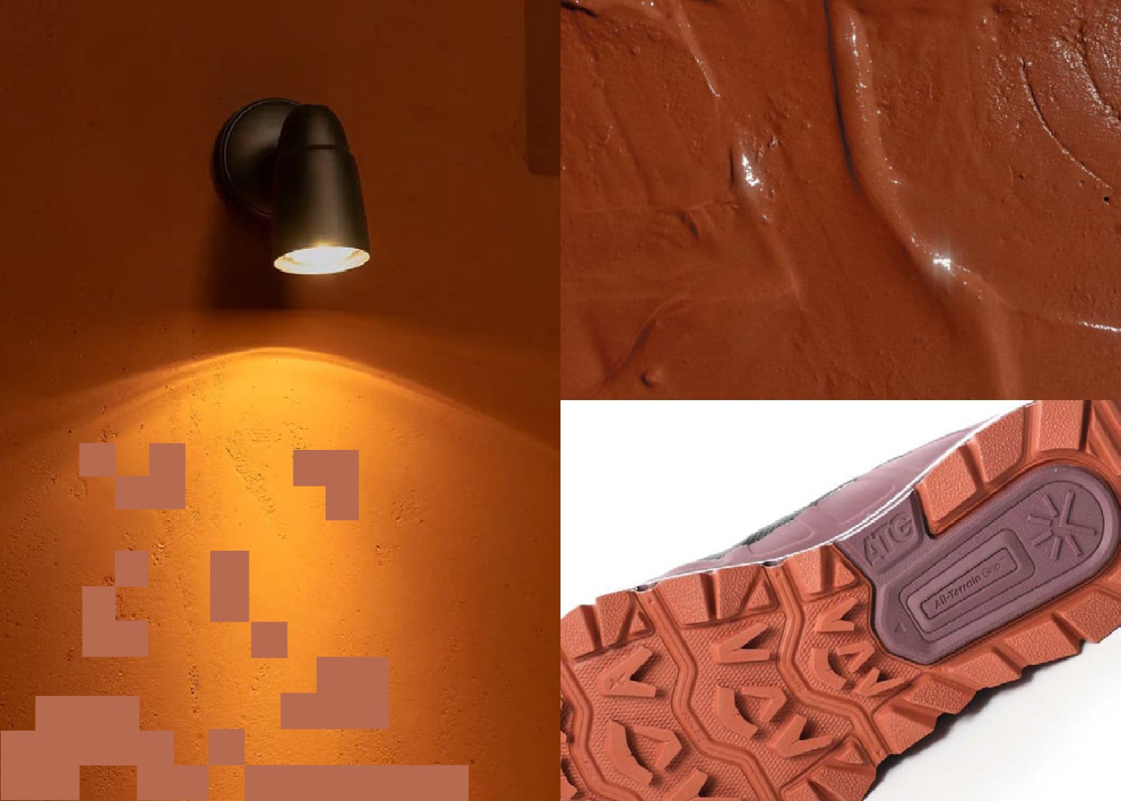
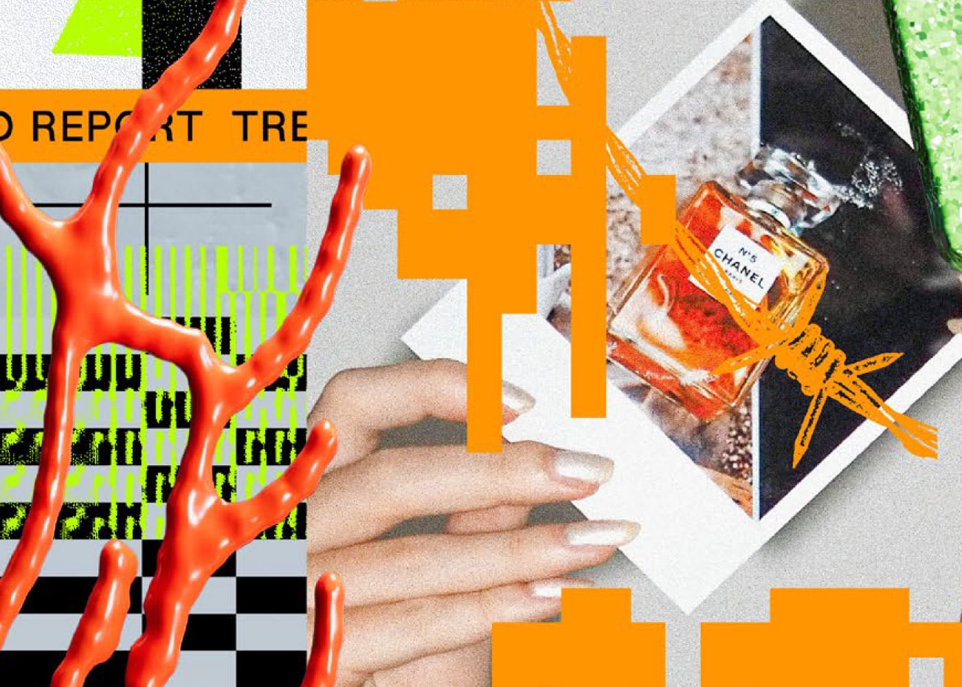
Chartreuse
Wholesome, with a bit of trouble. Chartreuse is cheeky. If a colour can be, and this one absolutely can.
[FF/ FRAGMENTS]
TREND PREVIEW
Here’s a preview of one of the four trends shaping FRAGMENTS. Get a taste of what’s inside, then unlock the full report to discover the other three trends — and the ideas, insights and creative opportunities behind them.
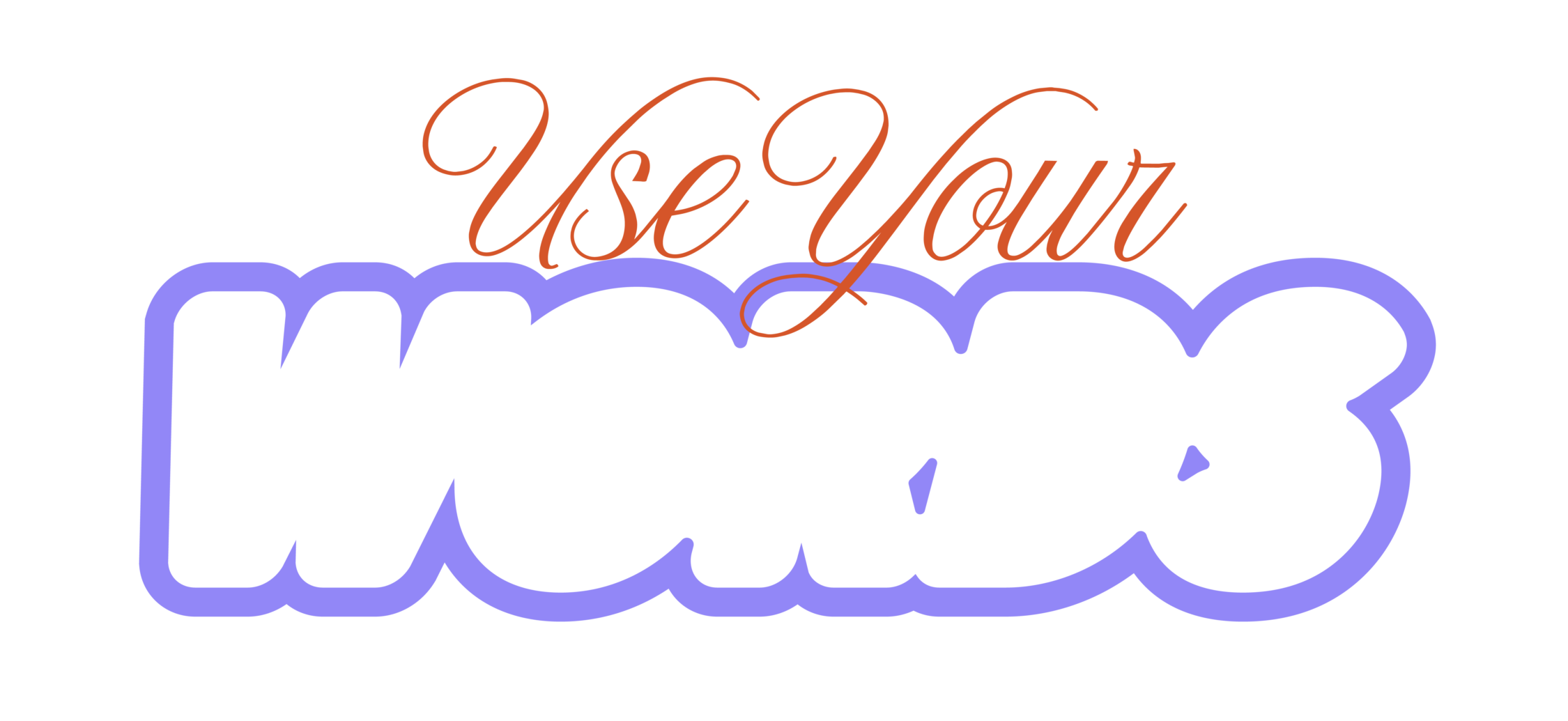

The linguistics of design: if we deleted your logo, would your words give you away?
Brands used to be seen first. Increasingly they’re heard and read first: voice assistants, conversational AI search, questions asked out loud into thin air.
And when your brand turns up as an answer, there’s no logo. No palette. No typeface to hide behind. No grid, no art direction, no beautifully considered spacing.
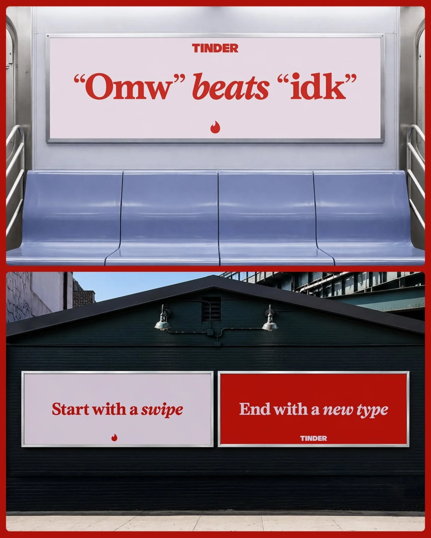
Tinder
Porto Rocha: Tinder rebrand a new voice for dating. The first rebrand in 10 years
Tone of voice isn't the garnish anymore. It's the identity system.
In 2026, traditional search engine volume will drop 25%, with search marketing losing market share to AI chatbots and other virtual agents. According to Gartner Inc., the direction isn’t in dispute. Your brand is being described, summarised and recommended by something that has never seen your brand guidelines.
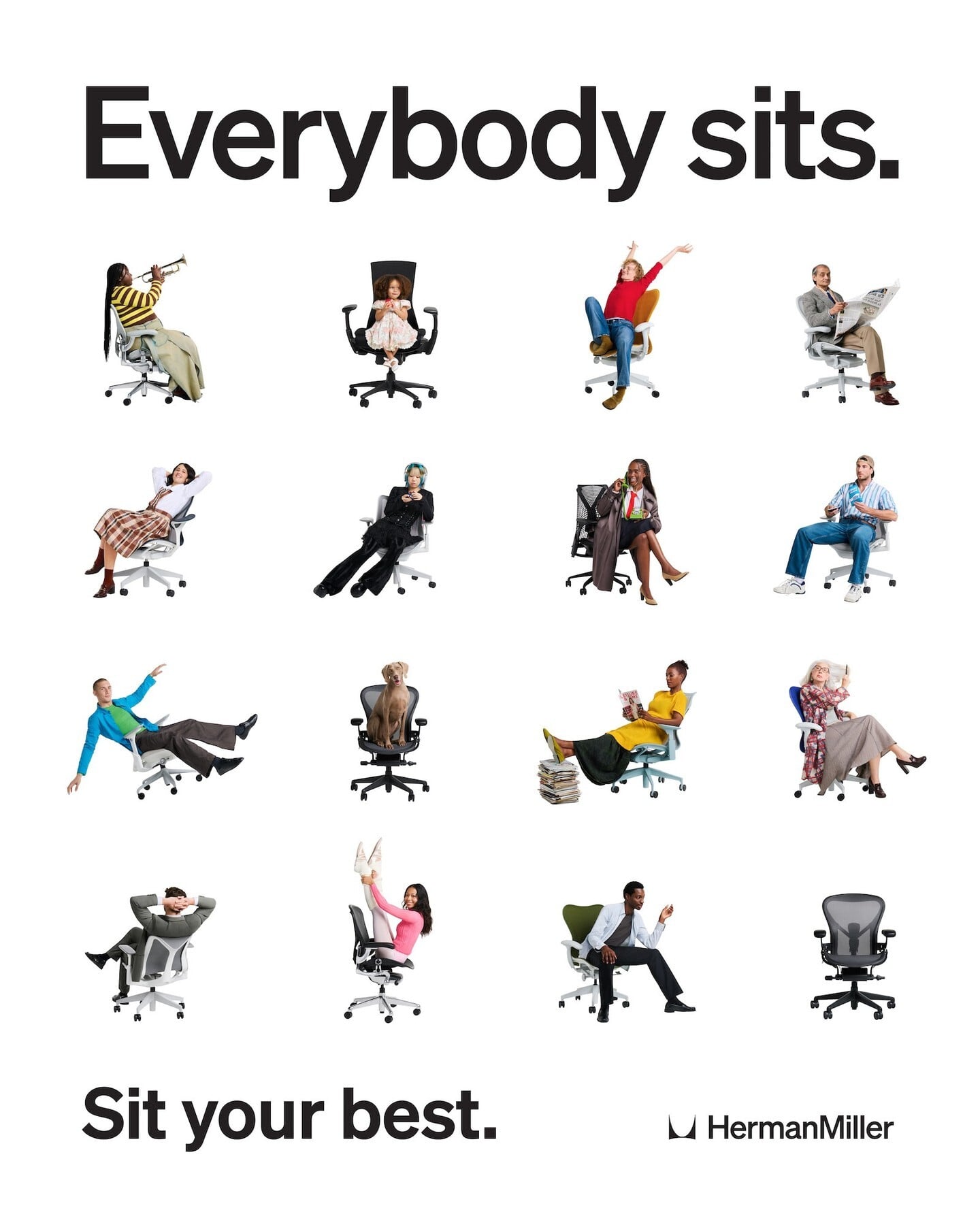
HERMAN MILLER
Everybody Sits is a global Herman Miller campaign by Inside Looks that celebrates the universal act of sitting through playful, human-centred imagery and storytelling. By Look.inc
Words carry meaning.
That’s not a new construct. Does what it says on the tin. Seeing the wood for the trees. Say what you mean. One word can say everything.
What’s new is that words are sometimes now doing the job the logo used to do. And it doesn’t stop at copy either: it’s the motion, the illustration, the way the style guide talks about itself.
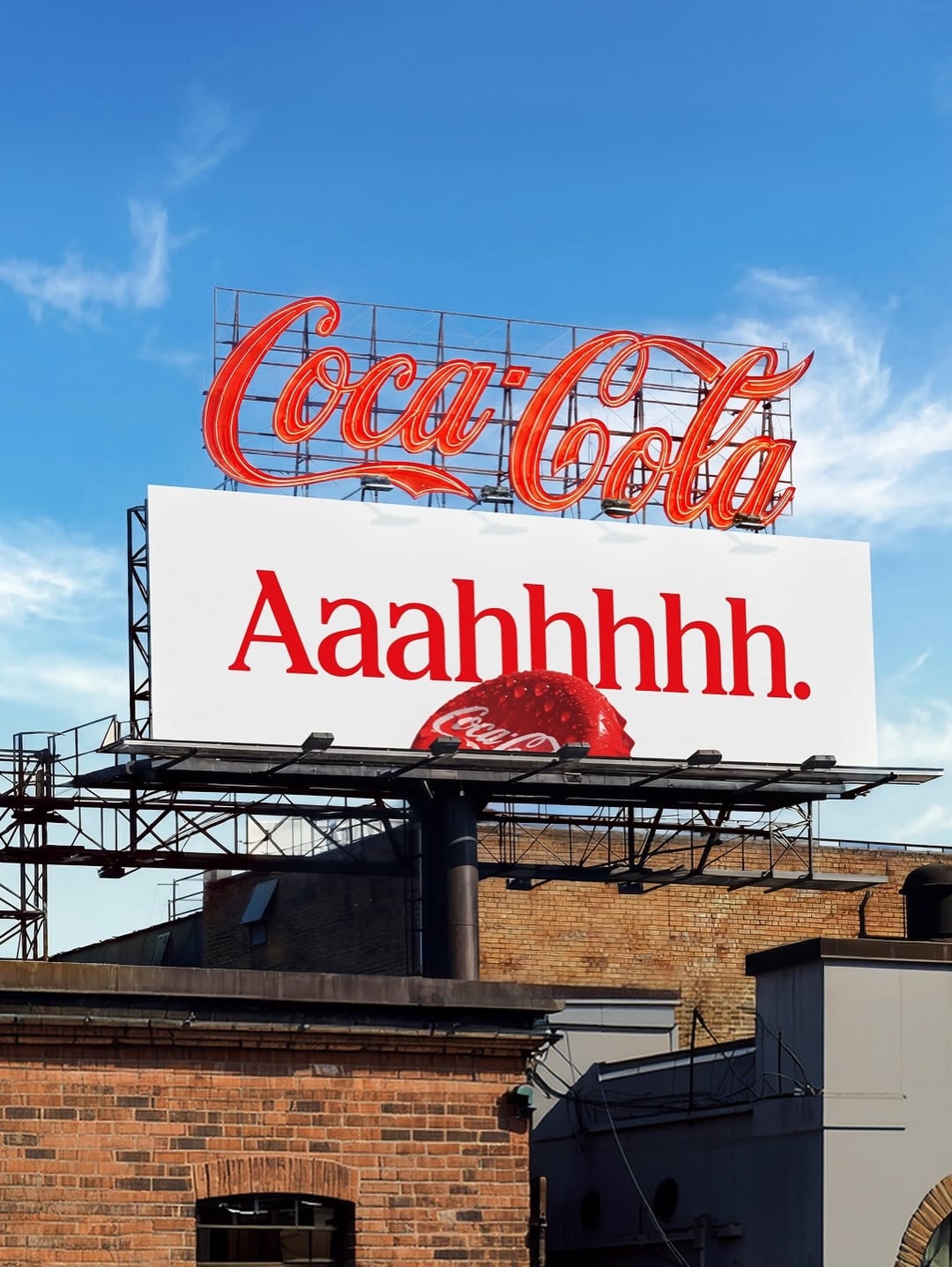
Coca-Cola
Coca-Cola’s ‘Better With’ is a bespoke typeface blending the brand’s typographic heritage with a playful, expressive modern identity. Designed by Brody Associates
The fragment:
Your words are the smallest piece you own, but they’re the only ones that survive every format. Stripped of the visuals, spoken aloud, retyped by a stranger, paraphrased by a machine, words are what’s left. If your words don’t sound like you, nothing does.
Choose your words like you’d choose a typeface: with a reason, a reference, and a strong opinion about the alternatives.
Gartner predicts search engine volume will drop 25% by 2026, due to AI chatbots and other virtual agents
Gartner Inc. February 19, 2024
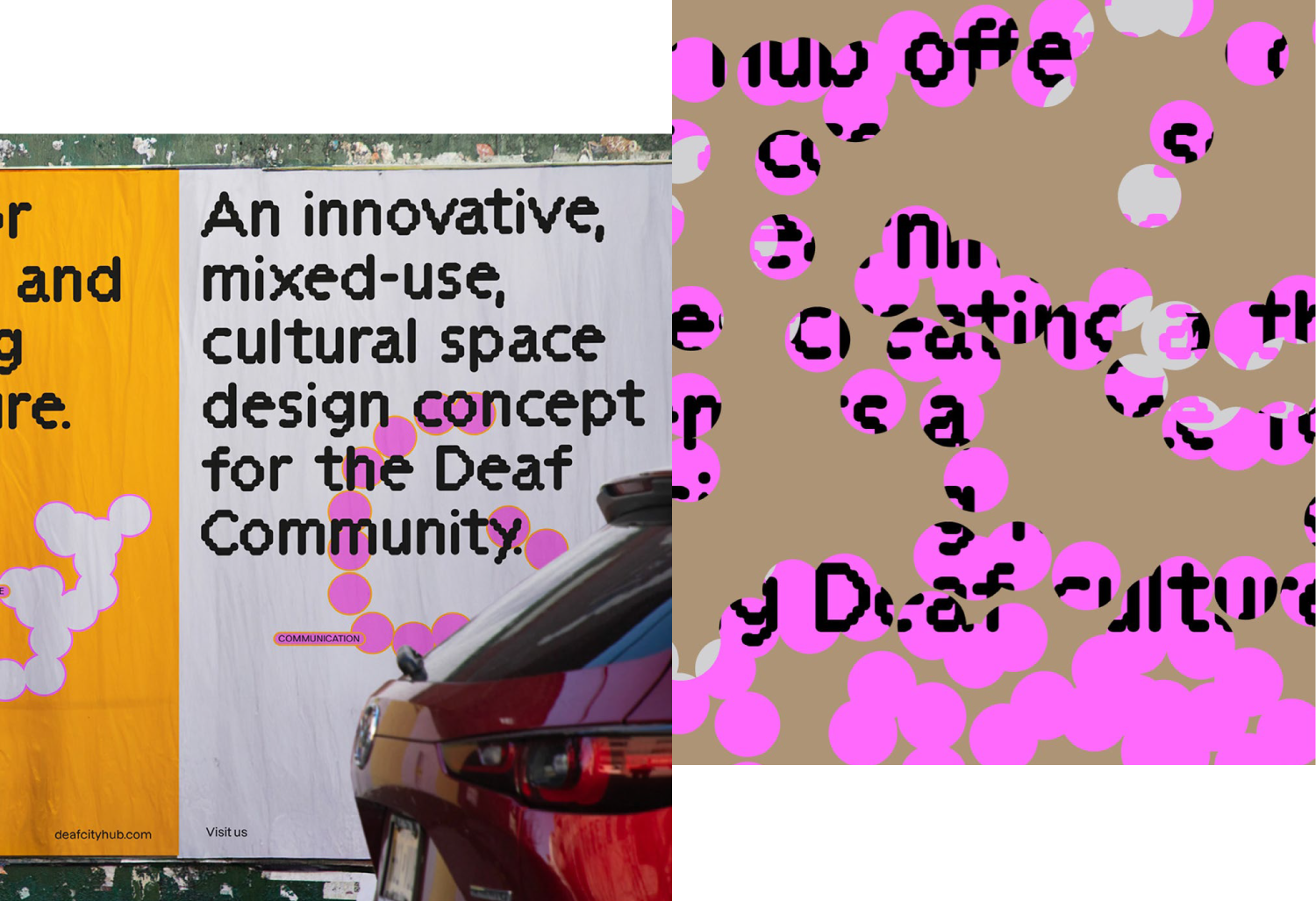
DeafCity Hub
DeafCity Hub’s dynamic identity uses British Sign Language, motion capture and creative coding to celebrate Deaf culture through movement.

-
Run the logo-off test. Delete every visual asset from your last three pieces of comms and read what’s left out loud. If it could belong to a competitor, you haven’t got a verbal identity, you’ve got a house style.
-
Write the system, not the vibe. “Friendly but professional” is not a tone of voice. Sentence length, rhythm, the words you rule out. That’s a system. That’s the work. Design the spoken version. If your brand had to introduce itself with no image at all, what’s the one sentence? Write that first. Everything downstream is a fragment of it.
-
Assume you’ll be paraphrased. Make the description hard to get wrong. The sharper the language, the harder it is to misinterpret.
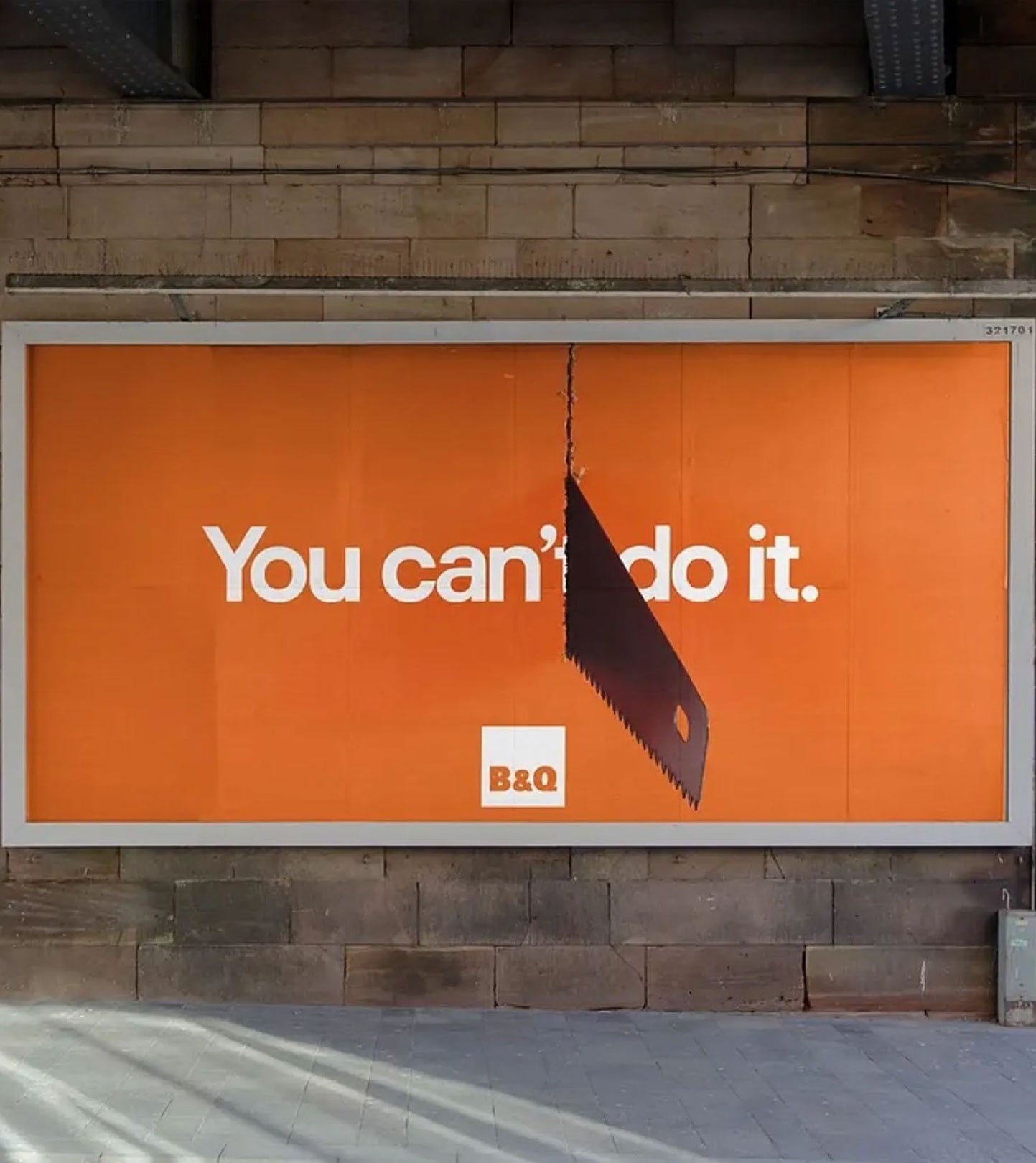
B&Q
‘You Can Do It’ campaign uses bold, intimidating tool imagery and playful motivational copy to give DIY novices the confidence to get started.
Tinder
Porto Rocha: Tinder rebrand a new voice for dating. The first rebrand in 10 years
HERMAN MILLER
Everybody Sits is a global Herman Miller campaign by Inside Looks that celebrates the universal act of sitting through playful, human-centred imagery and storytelling. By Look.inc
Coca-Cola
Coca-Cola’s ‘Better With’ is a bespoke typeface blending the brand’s typographic heritage with a playful, expressive modern identity. Designed by Brody Associates
DeafCity Hub
DeafCity Hub’s dynamic identity uses British Sign Language, motion capture and creative coding to celebrate Deaf culture through movement.
B&Q
‘You Can Do It’ campaign uses bold, intimidating tool imagery and playful motivational copy to give DIY novices the confidence to get started.
Piece it together
Vol. 4 FRAGMENTS
35 pages of trends, insight and inspiration. Four design trends. Four colour trends. Three creative perspectives. Get the full report and explore what fragmentation means for brands, design and the year ahead.
Discussion
Join the chat
Share a take, challenge a contradiction, or leave a note for the next reader.
Click icons to pop
Time0
Score0